Amanda Way
Graphic Designer

LA Zoo

Vibrant Living Wellness Center

ATI Restoration

LA County Regional Planning
UX/UI

Conceptual

Photography

Signage
Logos


Los Angeles Zoo

To see my work for the Los Angeles Zoo, please visit this link:
Vibrant Living Wellness Center

Branding

Web Design

Social Media

VIBRANT LIVING WELLNESS CENTER
Branding
vibrant living wellness center
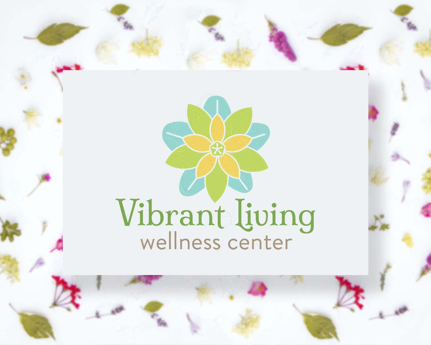
Vibrant Living Wellness Center is a functional nutrition and holistic health center owned by Heidi Hoffman, MPH RD. At Vibrant Living Wellness Center (or VLWC for short), Heidi and her team of healthcare practitioners specialize in Functional & Clinical Nutrition, Reiki, Neuro Emotional Technique, and Acupuncture.
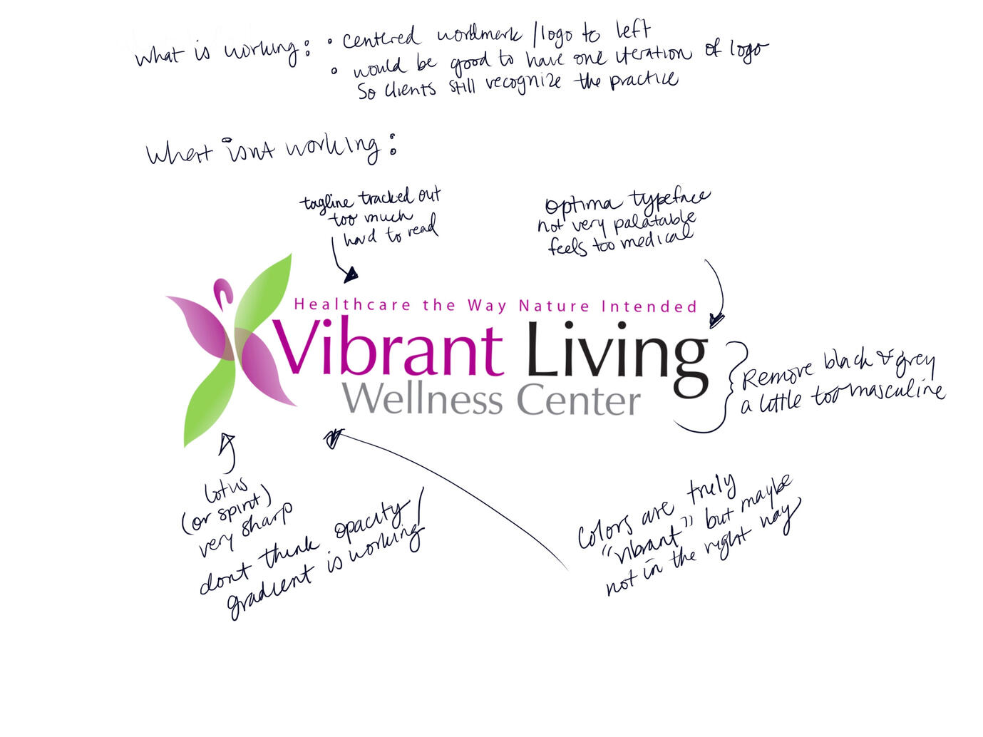
original logo audit
When approached about a rebrand, the pain points were that the existing brand was too sharp, the colors were too saturated and off-putting, and the overall brand didn’t have a sense of the femininity and holistic approach that Heidi wanted to convey in her practice.

redesign
With that information, I worked on developing a mark and color palette that was significant to VLWC’s unique practice.
Practitioners at VLWC use many different herbs and supplements supplied by Standard Process to help their patients. Many of the repeating ingredients in these herbs are Buckwheat. This is what led me to design a mark with buckwheat’s flower.
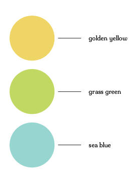
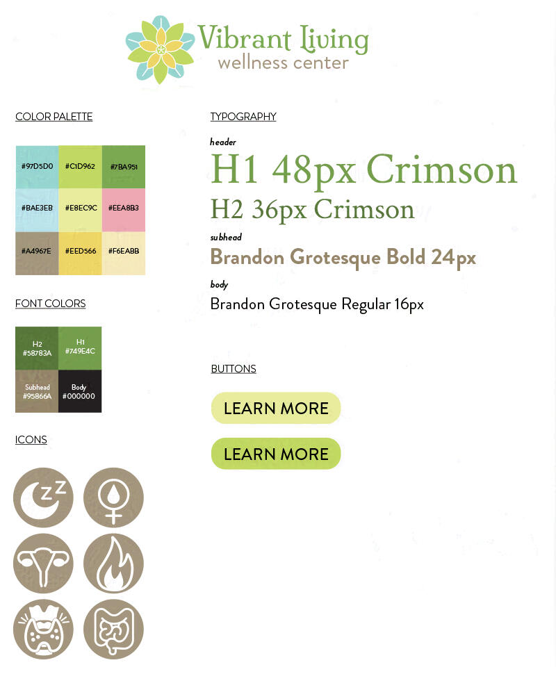
color palette
The color palette was drawn from sea blue, grass green, and golden yellow which are all energetically significant in Reiki.
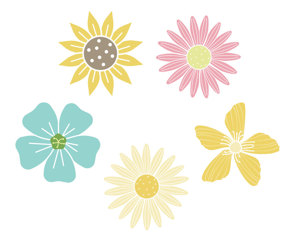
elements
Other herbs used are Sunflower, Echinaces, St Jon’s Wort, Chamomile, and Flax. I designed supporting flowers to be used throughout the brand, whether on collateral, promotional material, flyers and pamphlets, etc.
logo development
Healing Words
It was important to include food in the logo mark, because VLWC is primarily a nutritionist practice. My three design directions were:
to create a logo using actual food, specifically the pattern that celery and lettuce makes when cut at the bottom
a mark that just included a subtle element of food like the dot of the i as a buckwheat seed
a graphic representation of flowers from specific herbs used in practice


design direction #1
Celery Heart Print


design direction #2
Subtle Elements


final design direction
Flowering Buckwheat herb


type studies
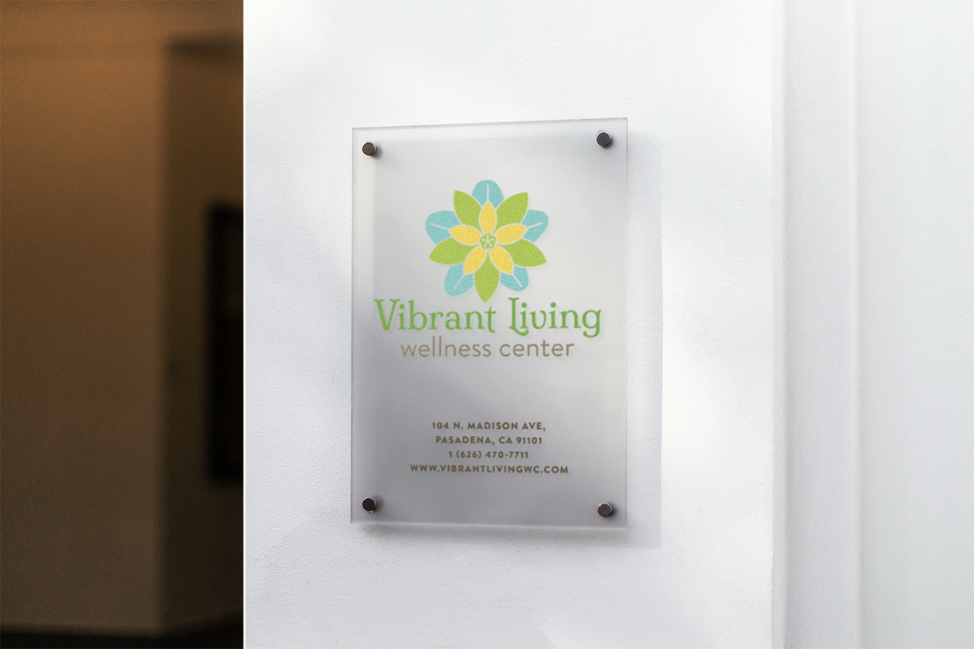
wall signage
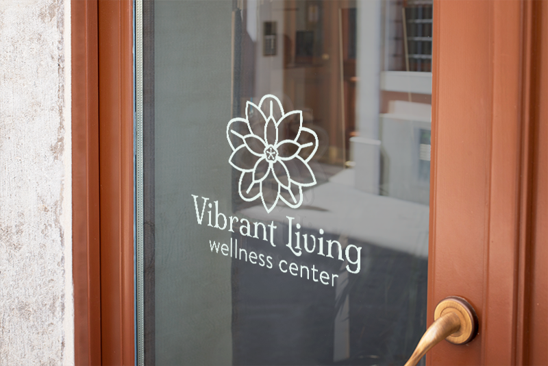
door signage
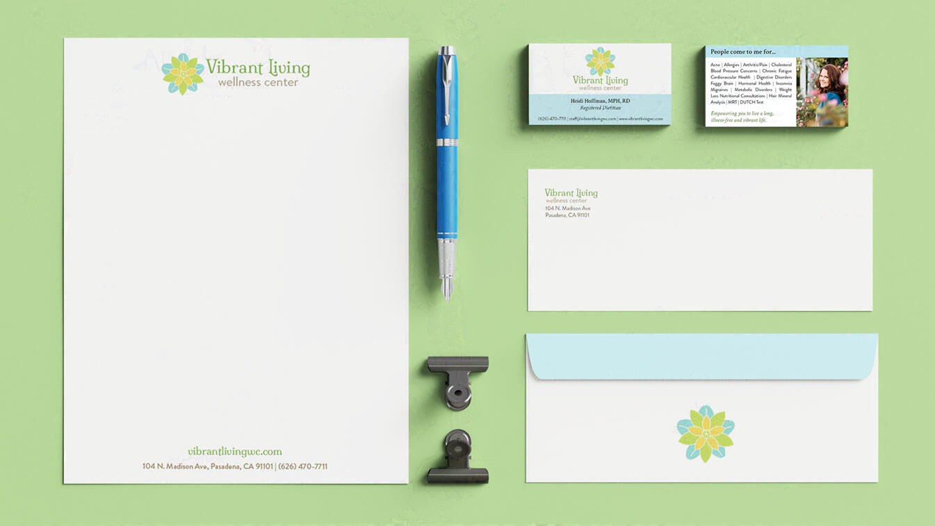
stationery


promo items
back to top
VIBRANT LIVING WELLNESS CENTER
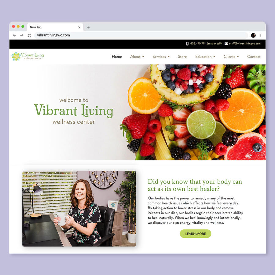
Website Design
style guide
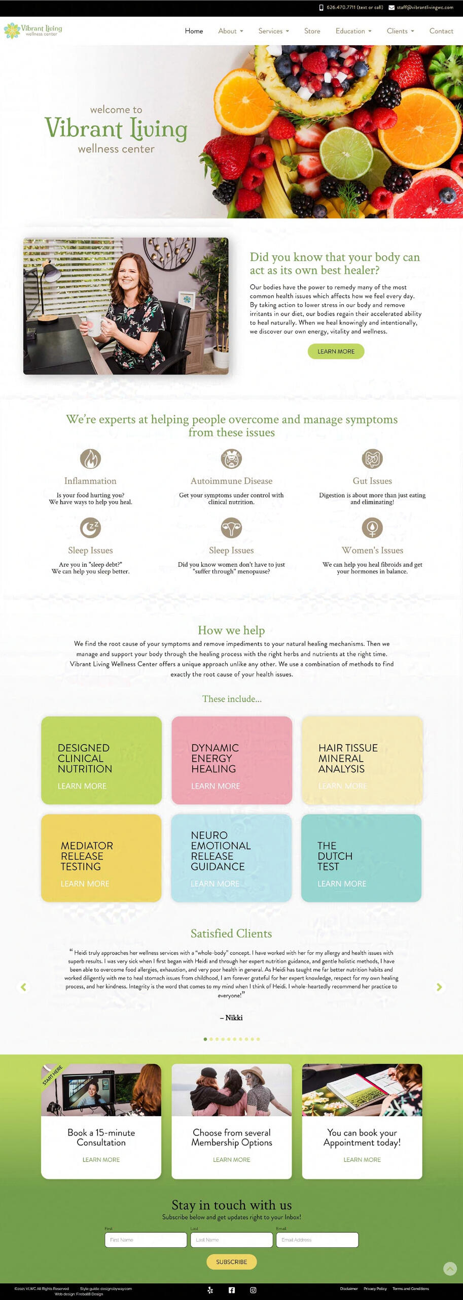
final page
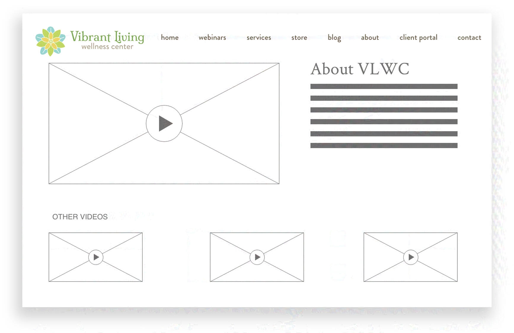
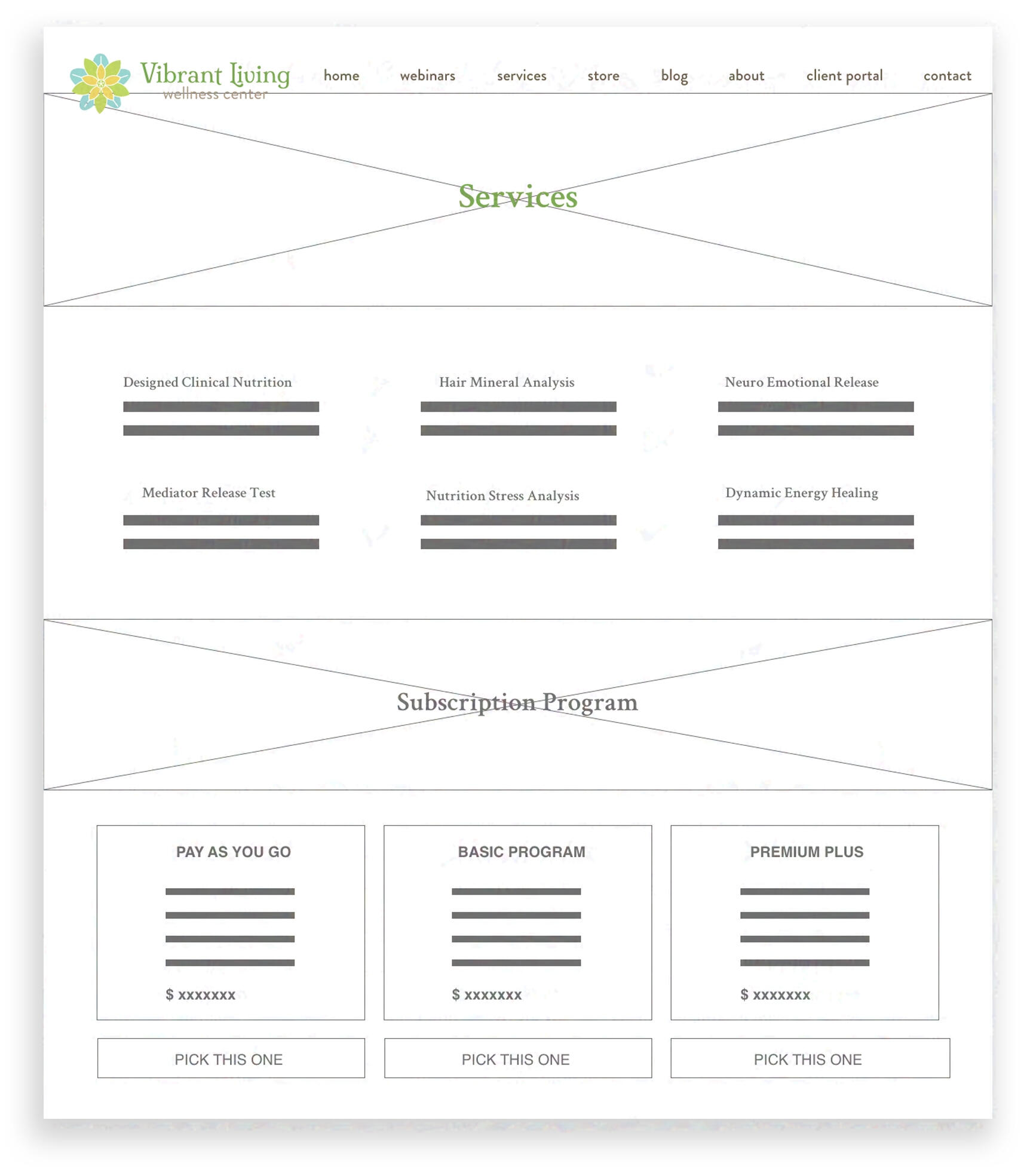
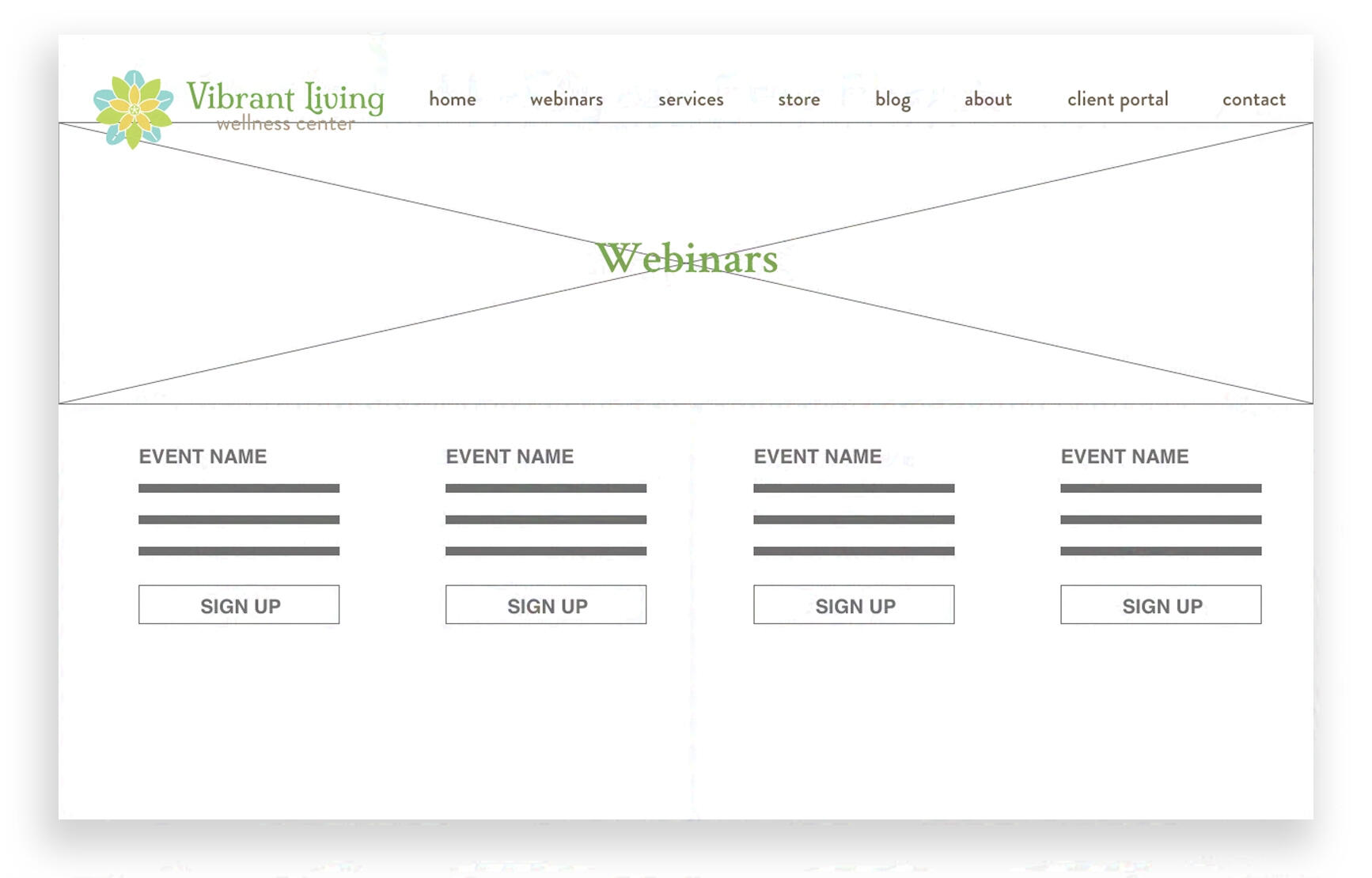
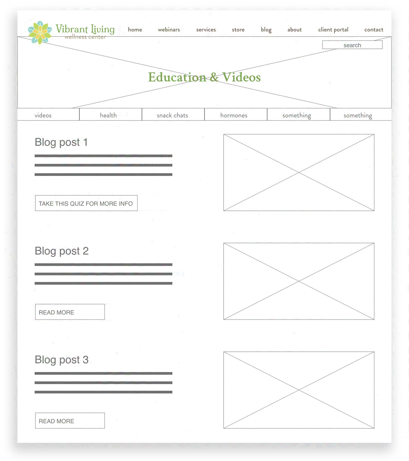
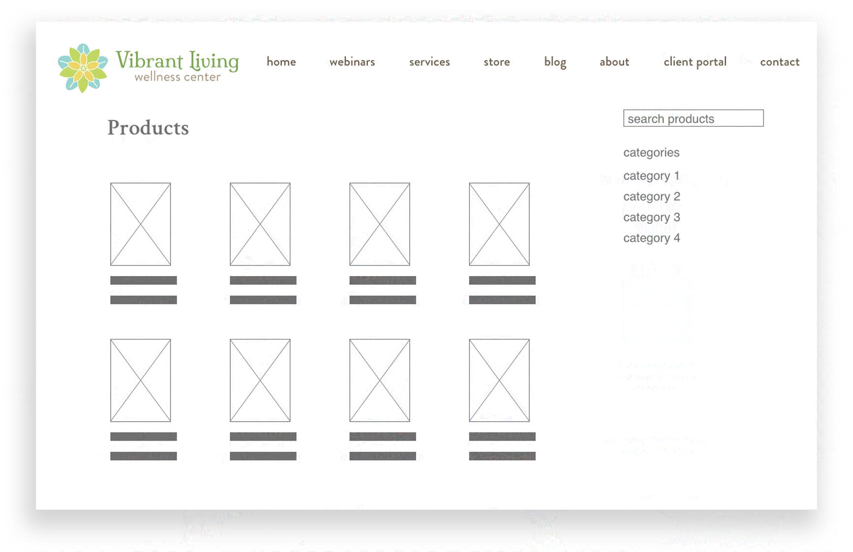
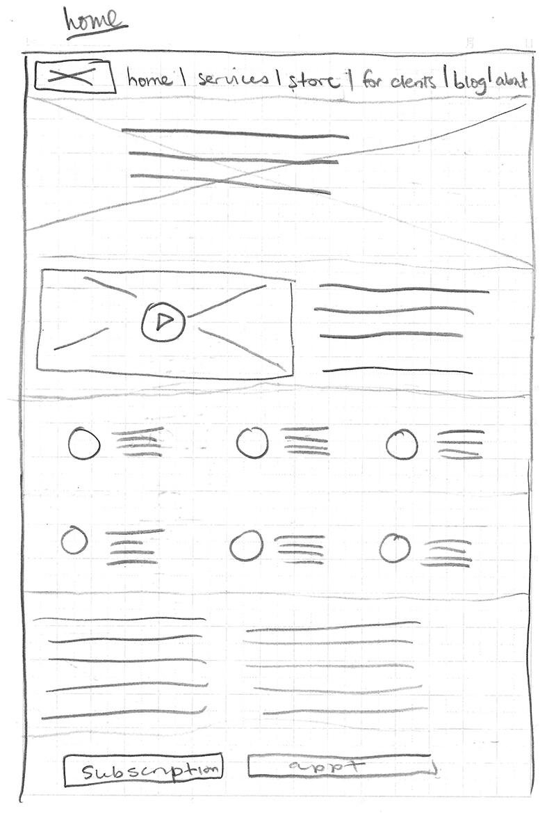
wireframes
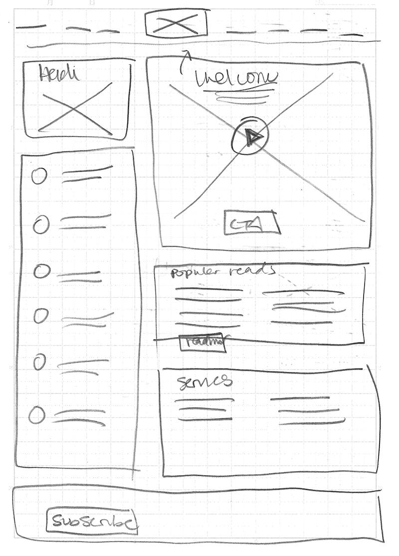
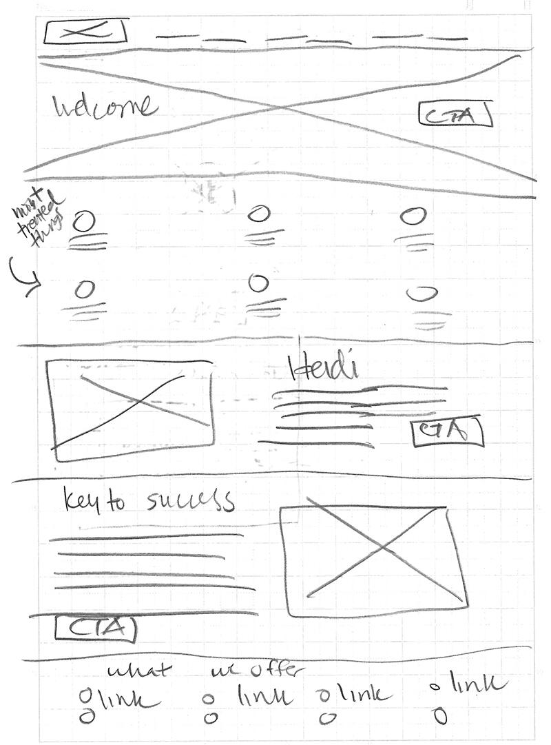
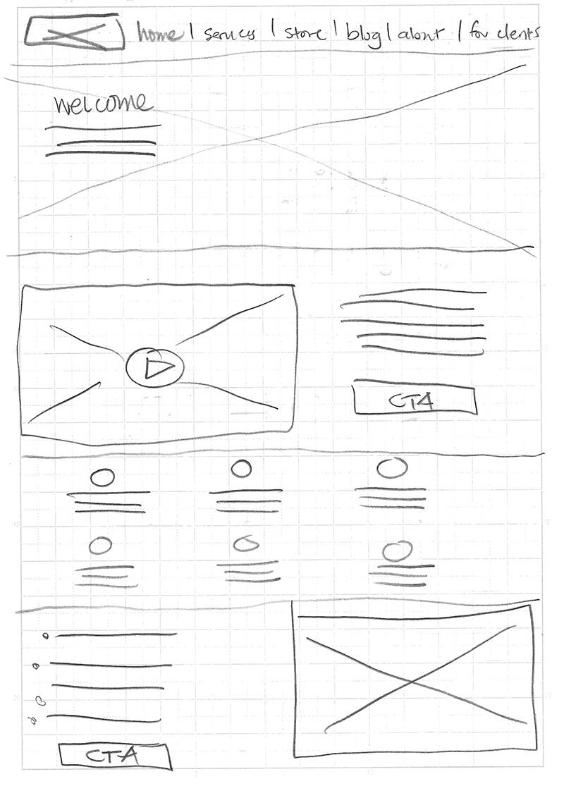
sketch wireframes
back to top
VIBRANT LIVING WELLNESS CENTER
Social Media
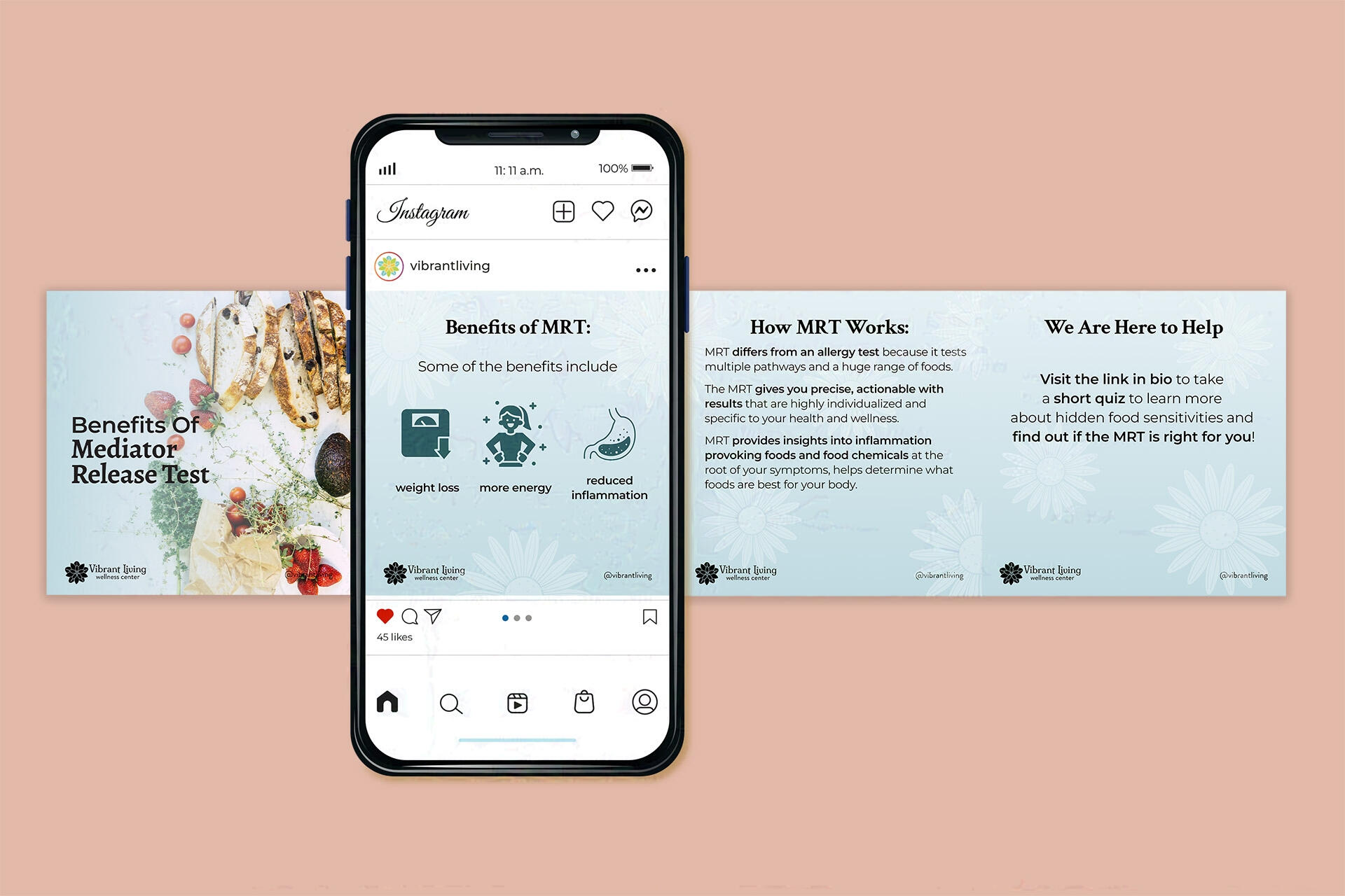
MRT Campaign
recipe video
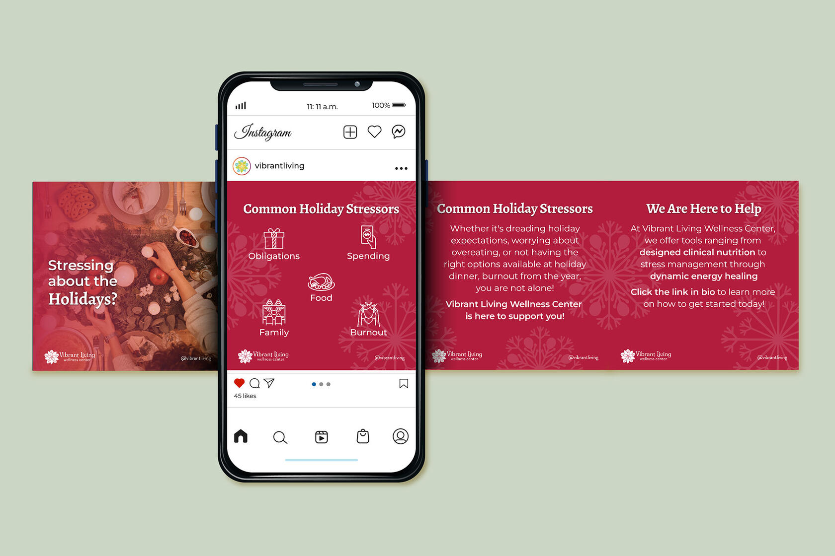
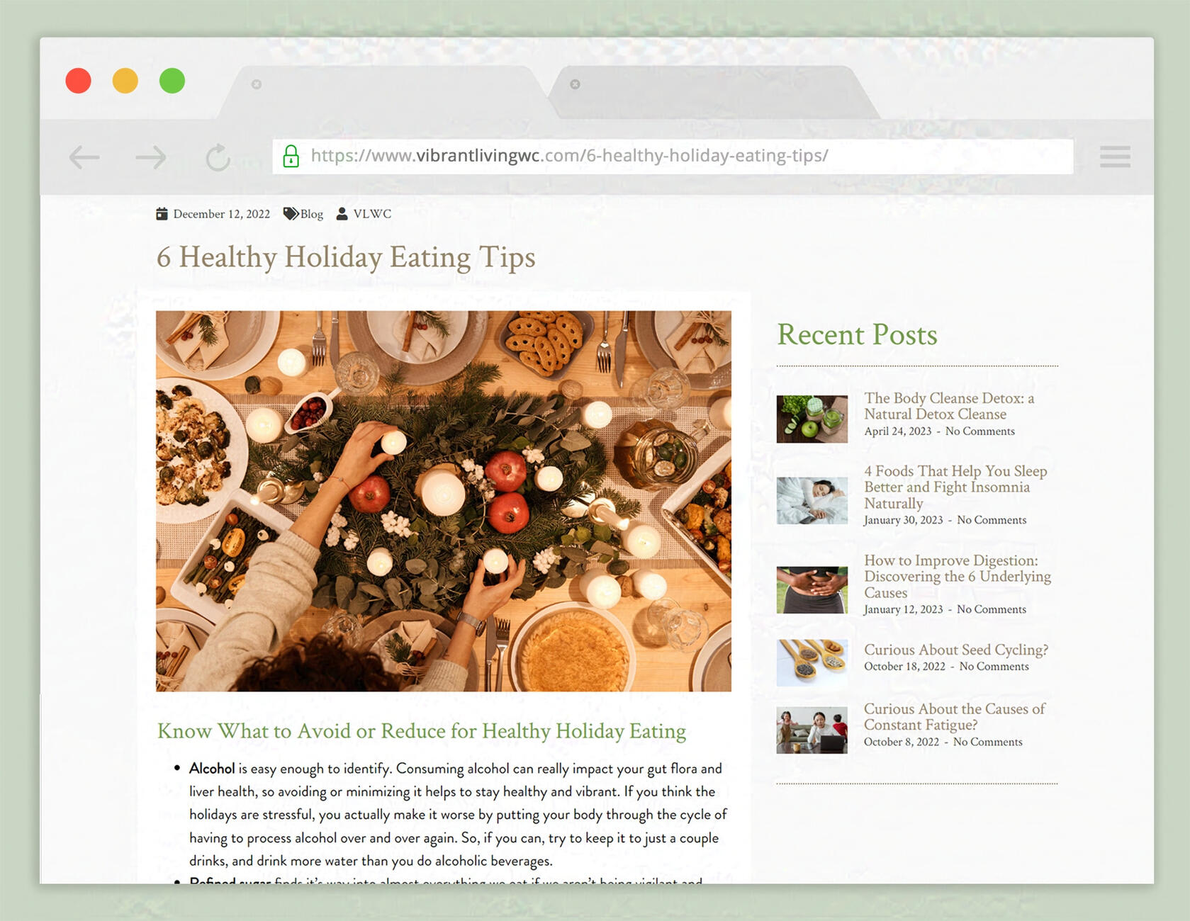
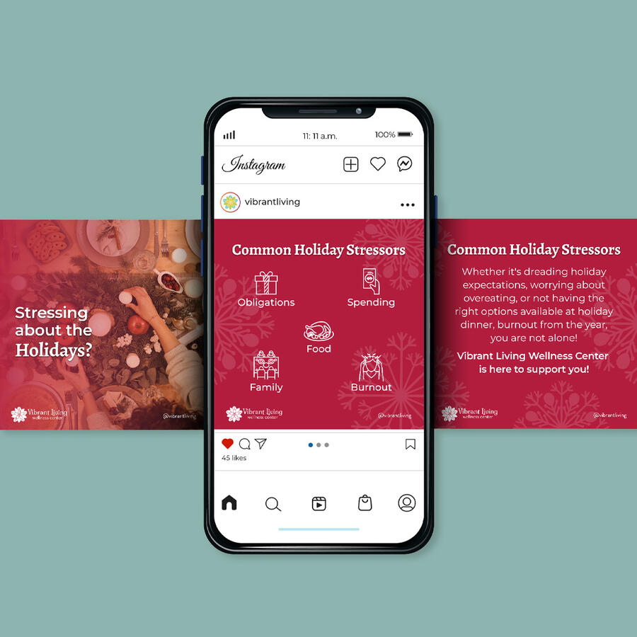
holiday campaign
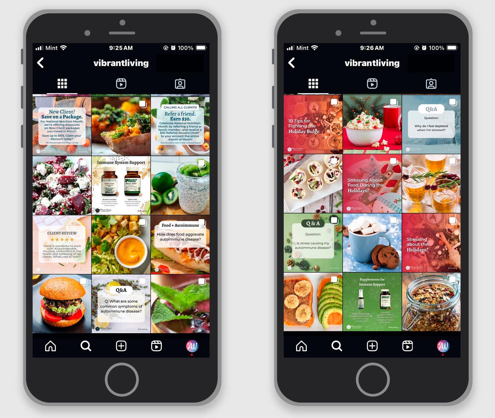
Instagram posts
Instagram post grid
back to top
About Me

I’m Amanda and I am a graphic designer based in Los Angeles, CA. I hold a BFA in Design from Woodbury University and I’m passionate about branding, user experience, and motion graphics.
Previously a veterinary technician, to sign artist, I now am a full-time graphic designer. When I’m not working on design projects, I’ll often be drawing, reading Star Wars EU books, playing in orchestra, or birdwatching.
Professional Experience
Graphic Designer | LA Zoo
October 2022–Present
Graphic Designer & Social Media Manager | Vibrant Living Wellness Center
July 2022–May 2023
In-House Graphic Designer | ATI Restoration
February 2021–July 2022
Freelance Graphic Designer
2018–2022
Graphic Design Intern | Los Angeles County Dept. Regional Planning
2019
Sign Artist | Guckenheimer
2018
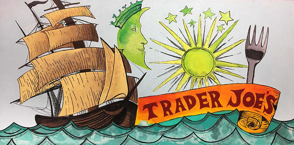
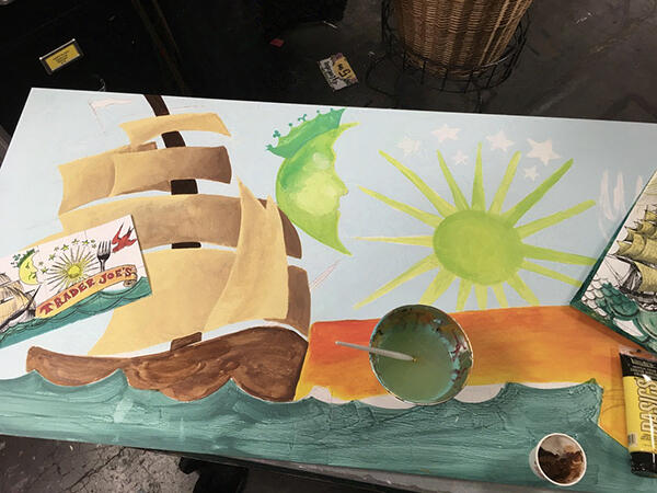
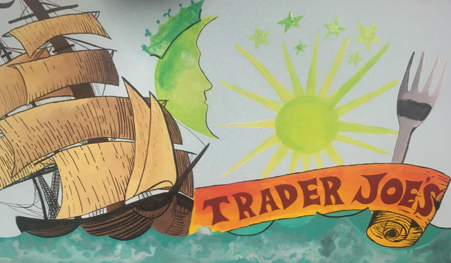
Sign Artist | Trader Joe’s
2013–2017
Awards
LAX 100% LA Selfie Station | 2019
GDUSA Students to Watch | 2021
LA County Volunteer of the Year Award Nominee | 2020
Woodbury University Faculty Appreciation Award | 2021
Extracurricular
Volunteer Graphic Designer | Los Angeles County | 2019
Print Manager | 7500 Magazine Woodbury University | 2019
Get in touch
Photography
© 2025 Amanda Way
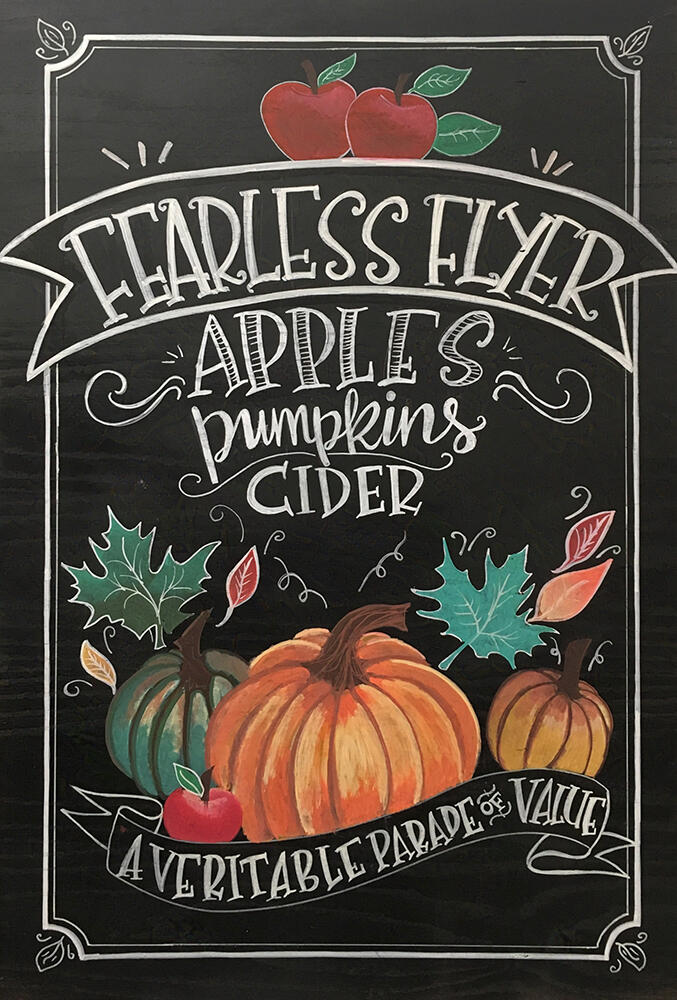
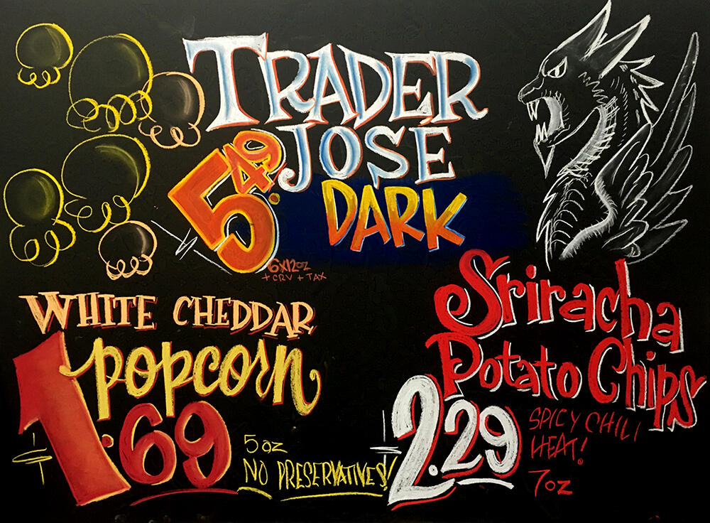
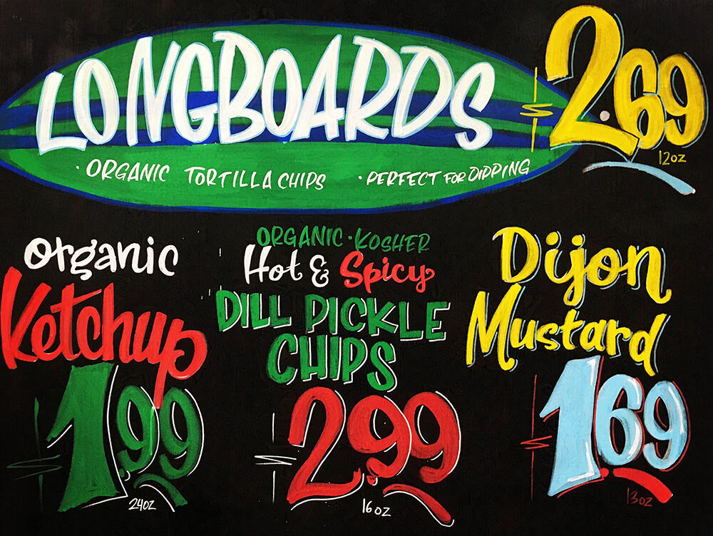
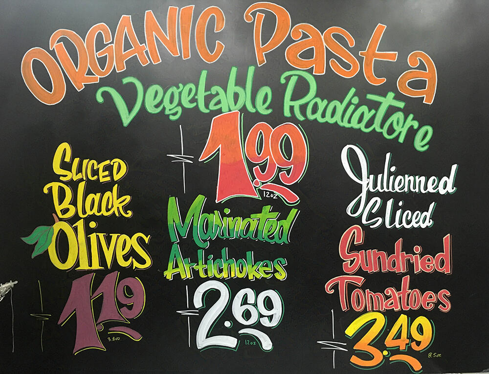
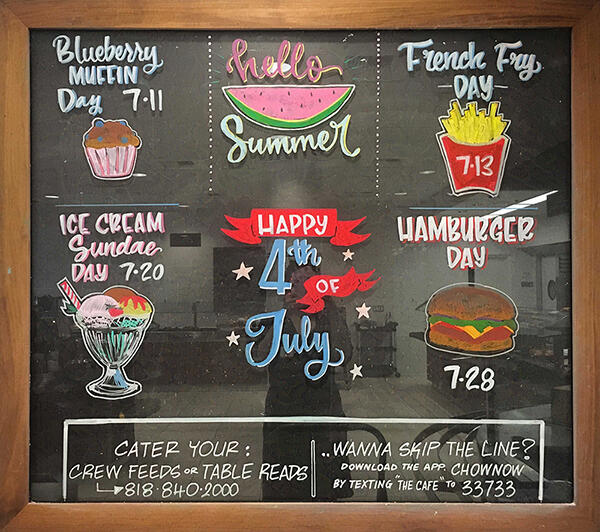
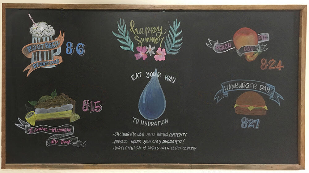
Fearless Flyer A-frame signs
acrylic & aerosol paint, paint pens on wood
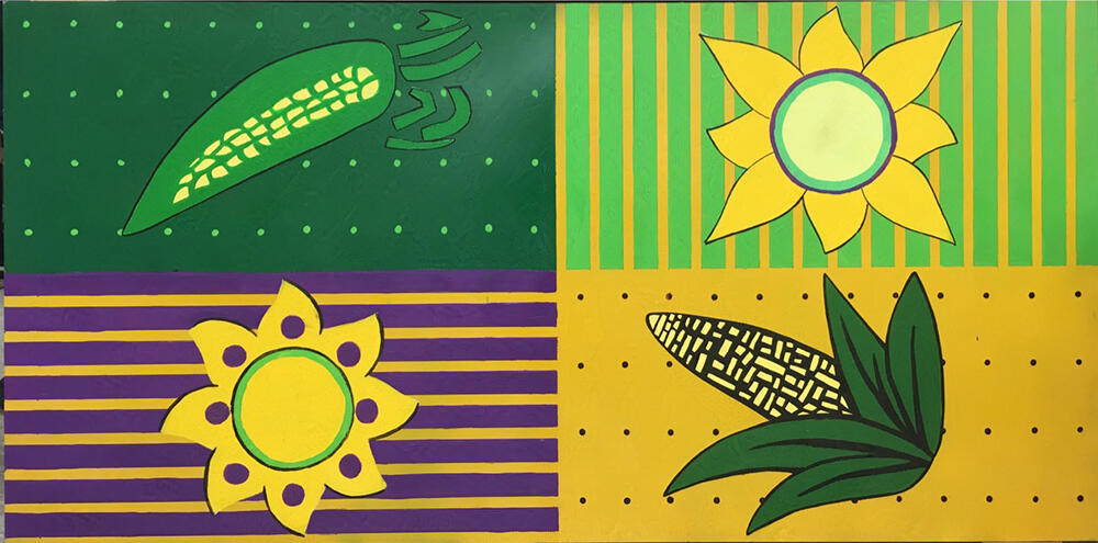
Permanent Display Signs
based off of various package designs at Trader Joe's
acrylic & aerosol paint
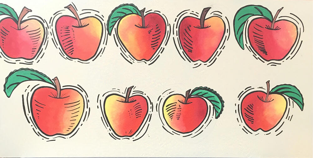
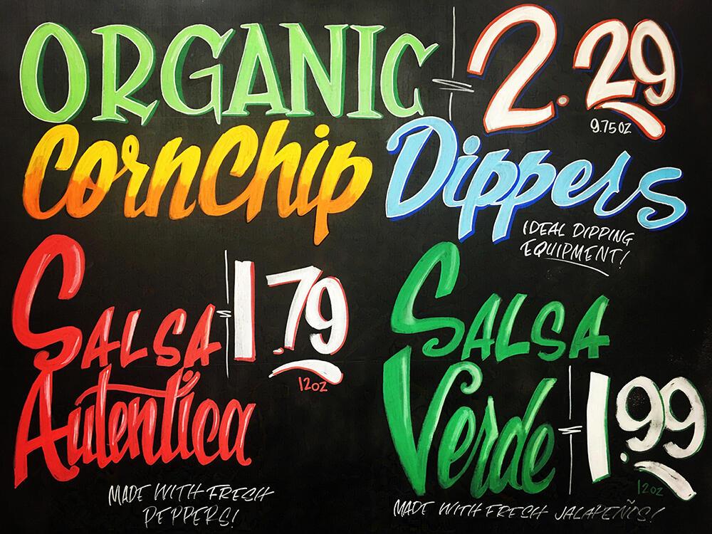
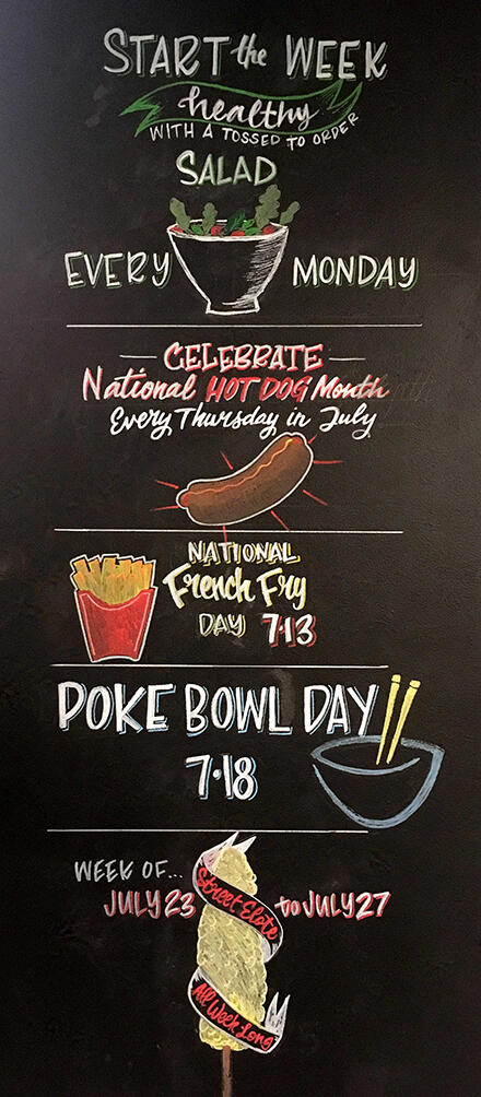
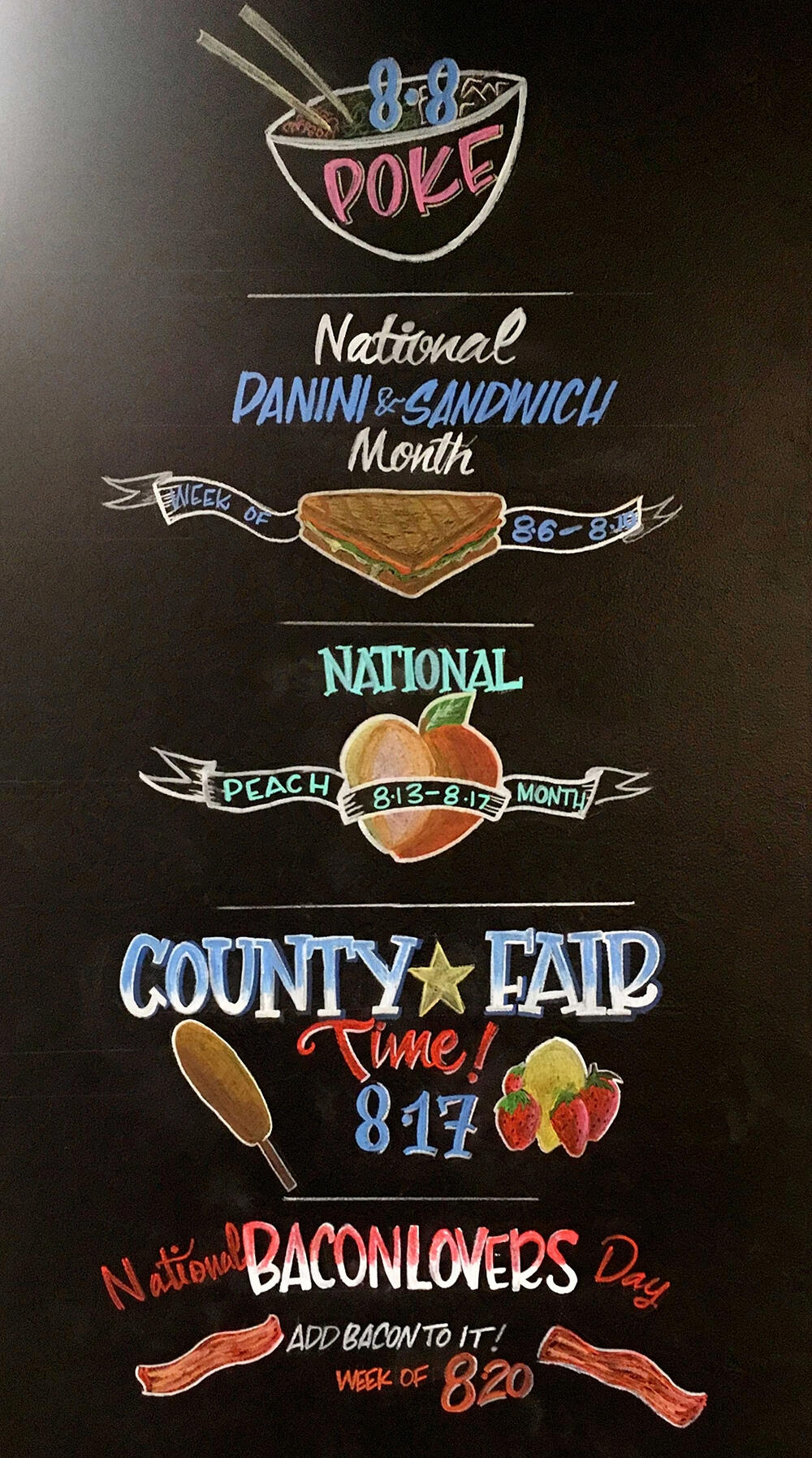
Weekly Display Signs
signs that change weekly & monthly for displays
paint pens & chalk pastel
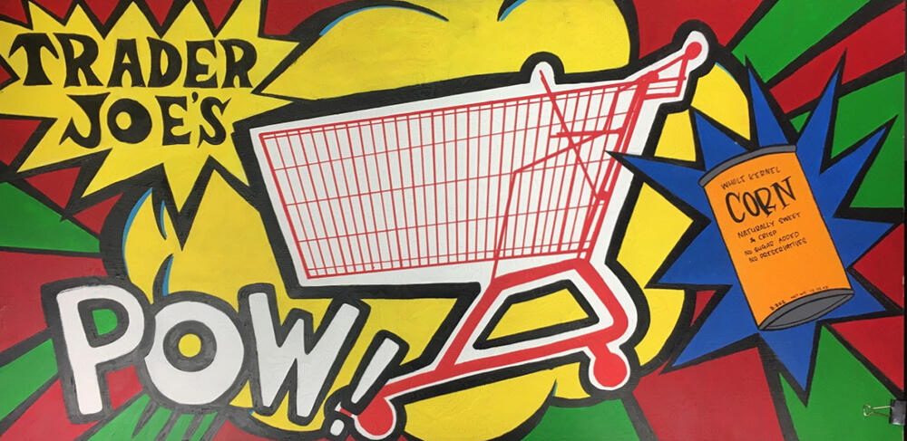
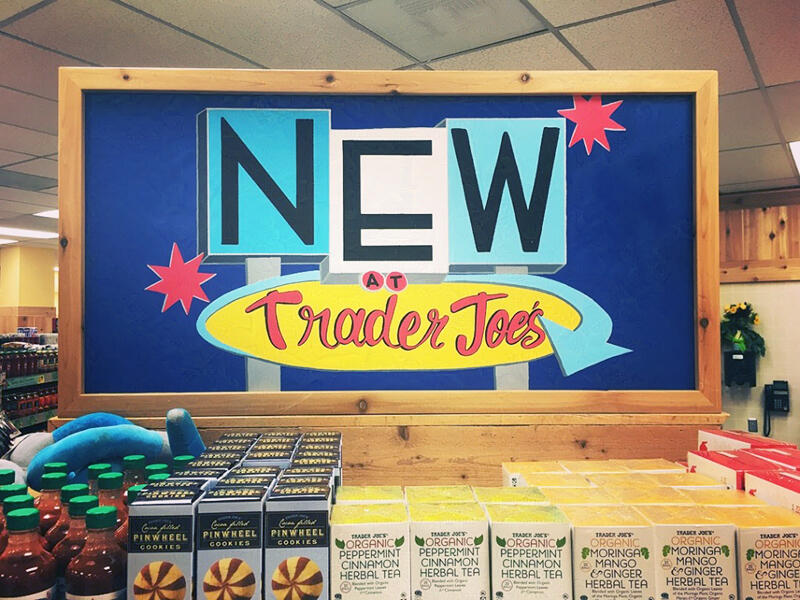
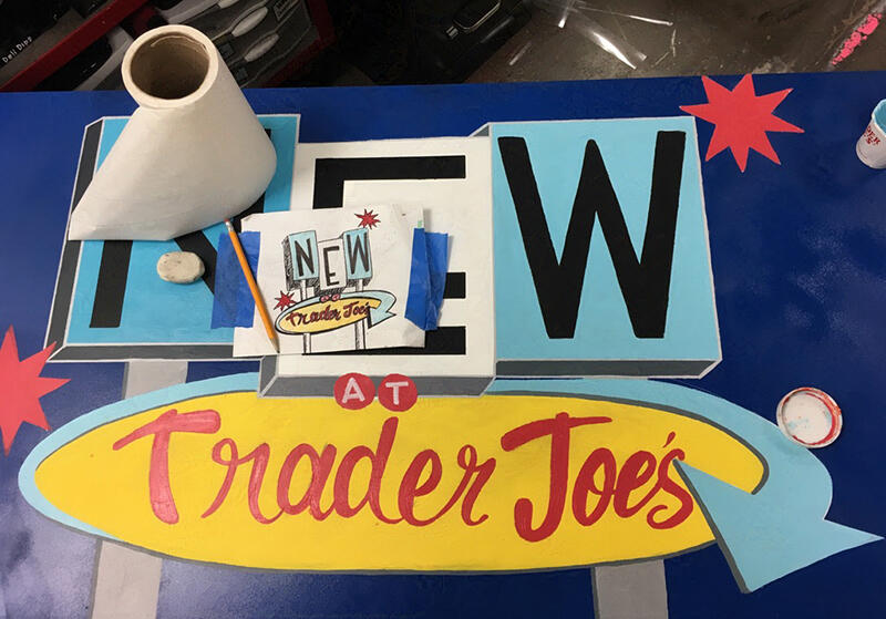
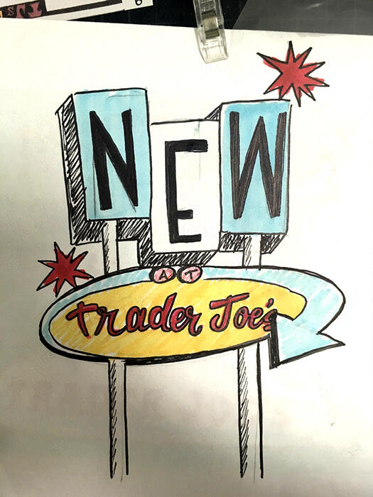
New Item Permanent Display Sign
based off mid-century signage & americana
Guckenheimer Sign Art
wall signs from Guckenheimer Cafes in Los Angeles businesses
paint pens & chalk paint
back to top
Branding + Campaigns
A selection of conceptual projects

Damaged Goods

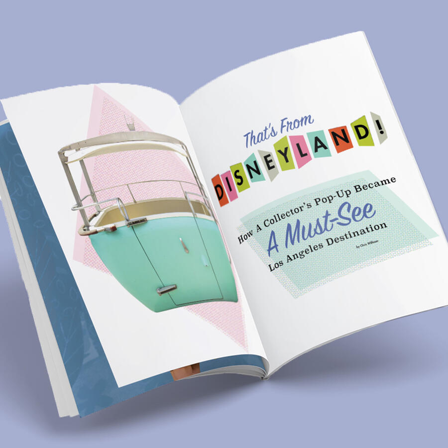
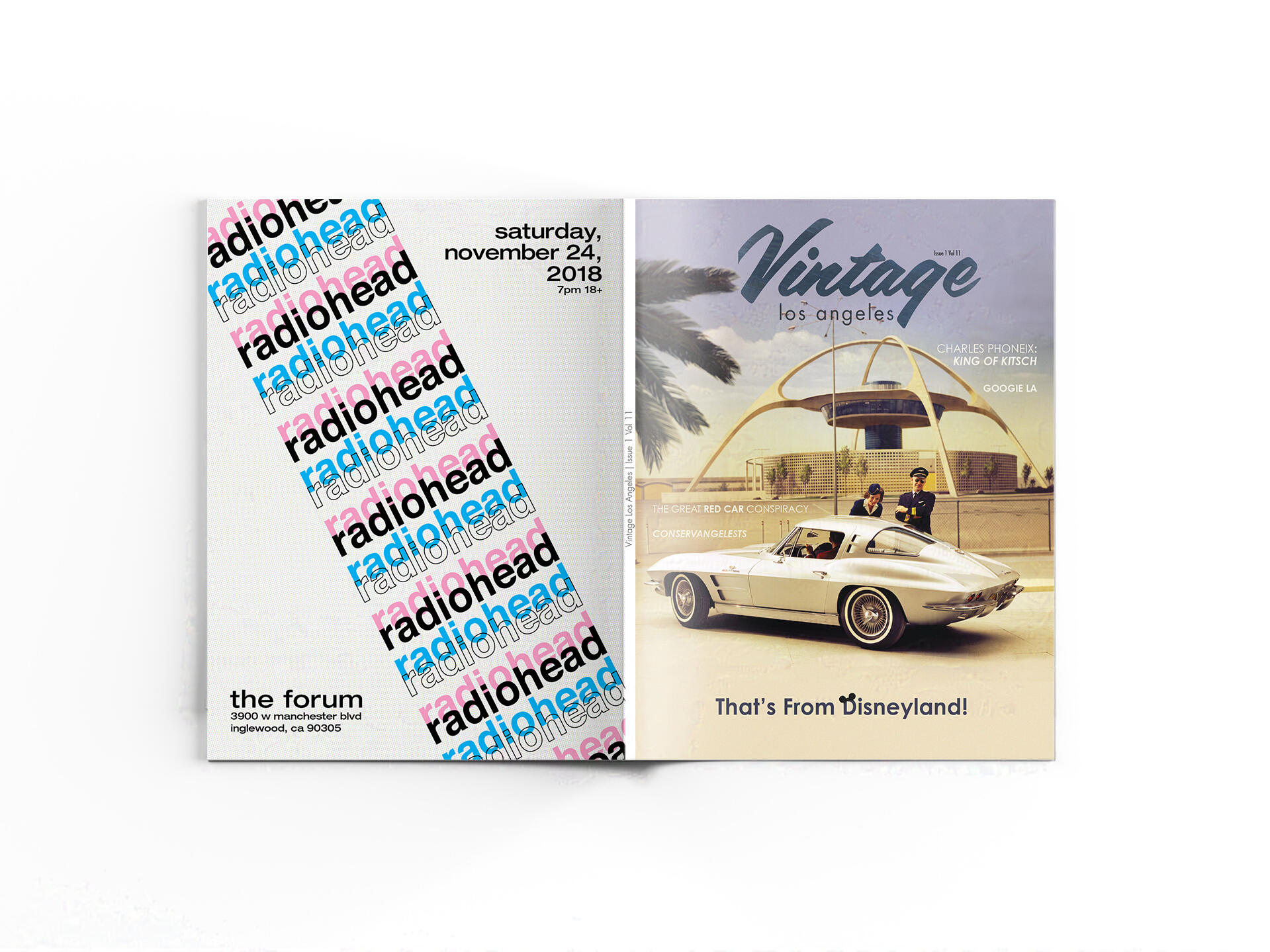
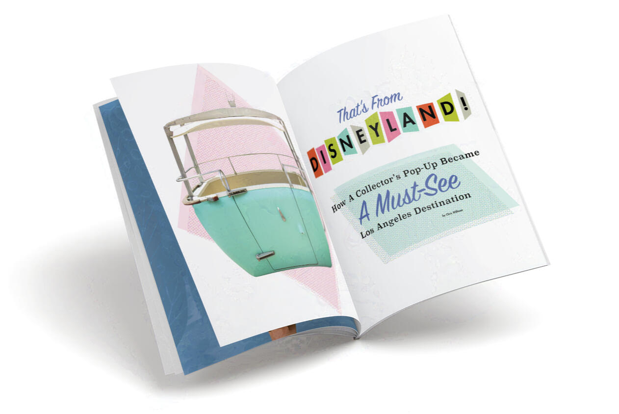
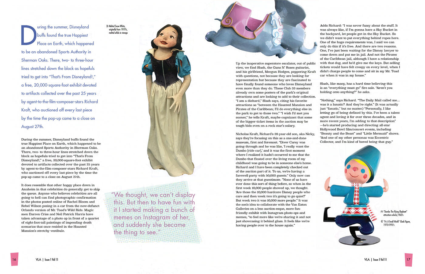
Vintage Los Angeles Magazine

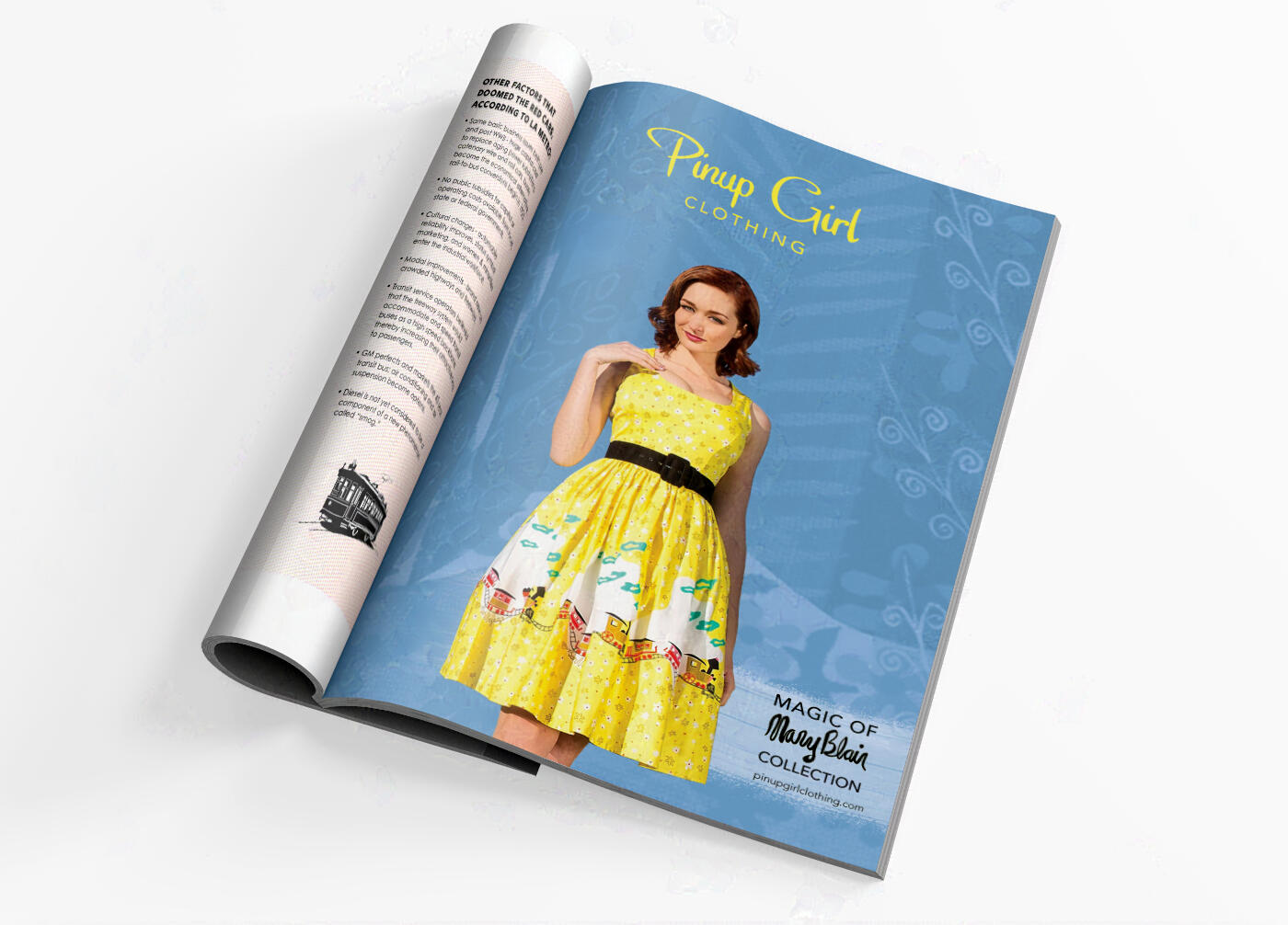
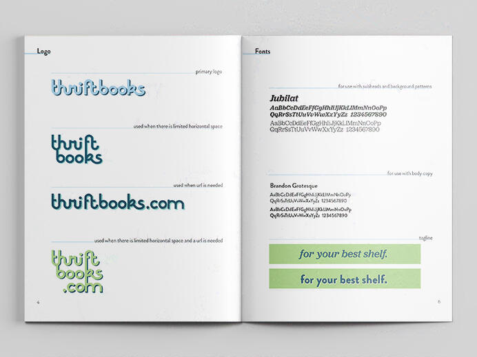
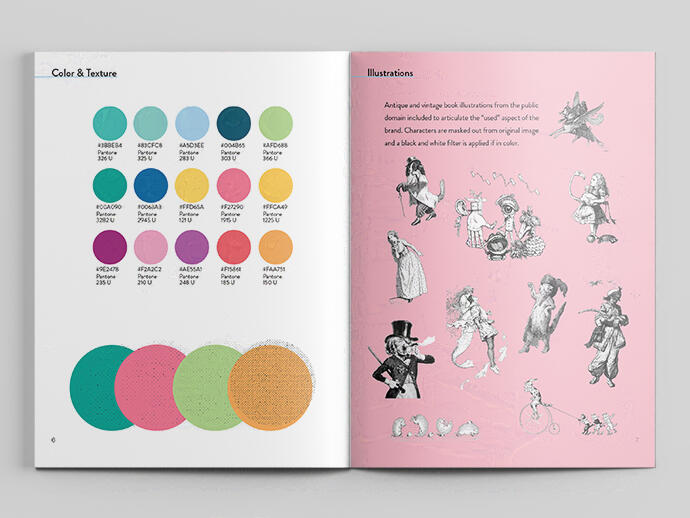
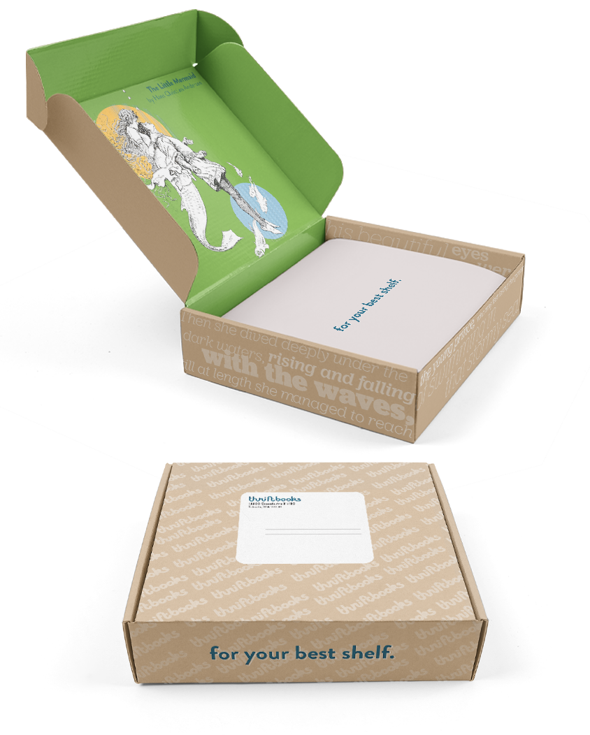
Thriftbooks

Album Covers

Blackwing x Field Notes
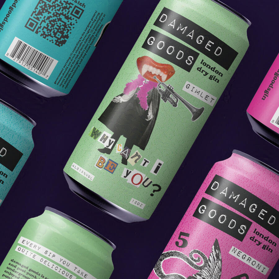
damaged goods
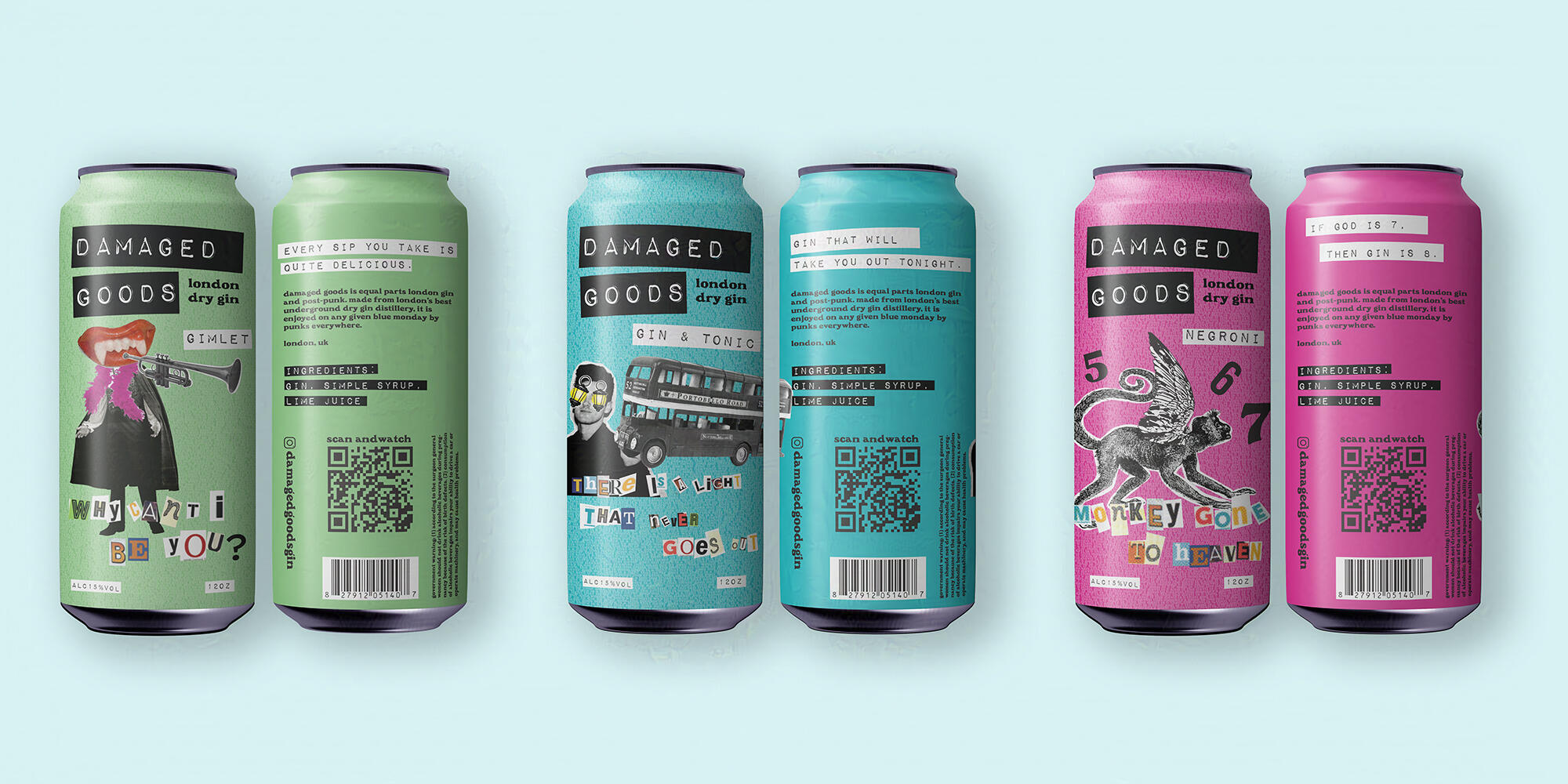


Damaged Goods
Package design
Damaged Goods is a gin brand I created based off of the underground club scene in Los Angeles.
Each beverage is a different gin cocktail accompanied by a different song title. I designed the images to represent the product names that come from the imagery of each respective band’s music video, album cover, etc.
Augmented reality
Damaged Goods cans have a built-in augmented reality experience. When you download the AR app and point your camera to the can, you can see a promo video.


inspo + concept
I drew lots of inspiration from some of my favorite artists of the 80’s & 90’s drinking.
If you like Siouxsie Sioux, Morrissey, Ian Curtis & Robert Smith, chances are you’ll like Damaged Goods.
look + feel
Cheap reproduction, cut and paste, bold marker, DIY, xerox texture are some of the ways to describe what I wanted Damaged Goods to feel like.
back to top
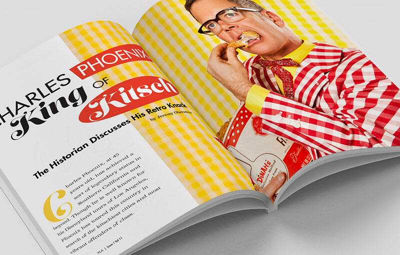
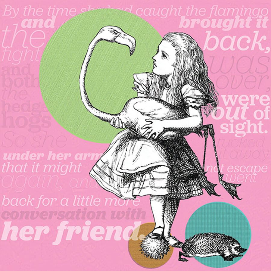
Inspired by Alison Martino’s Vintage Los Angeles, I designed this magazine to focus on LA history, vintage art and architecture, events and culture.
back to top

Thriftbooks is an online used bookseller that has been in business since 2003.


redesign approach
When designing the rebrand, I took a whimsical approach, giving life back into the brand by using images of characters in antique books. I paired these characters with text from the passages of their stories to add literary appreciation and create a new form of storytelling within the brand.
I used images from the public domain that were original book illustrations, ranging from the 1800’s and early 1900’s.
I paired these images with text from the passages that they would’ve been found in the original books.
style guide
collateral
Mailers would be recyclable folding cardboard boxes with imagery on the inside, and text from book passages on the outside.
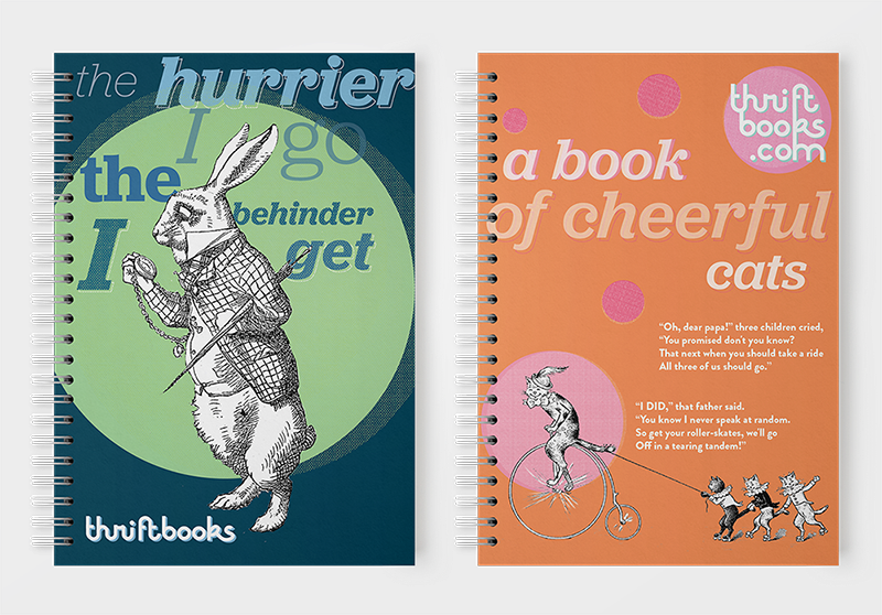
Spiral notebooks that would be available in the store and given away as promotions.
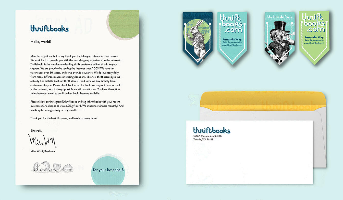
Stationery & bookmarks.
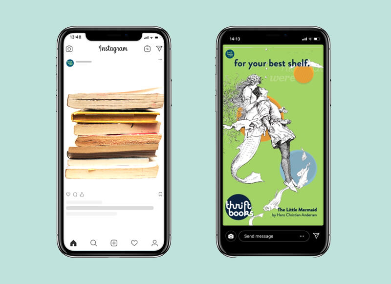
Digital ads
Since Thriftbooks is an online bookseller, I thought it would be most appropriate to make ads to be viewed on platforms such as Facebook, Instagram, and Pinterest. I created these whimsical animated ads using the illustrations, and altered them using Photoshop and After Effects.
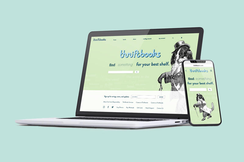
website + social media
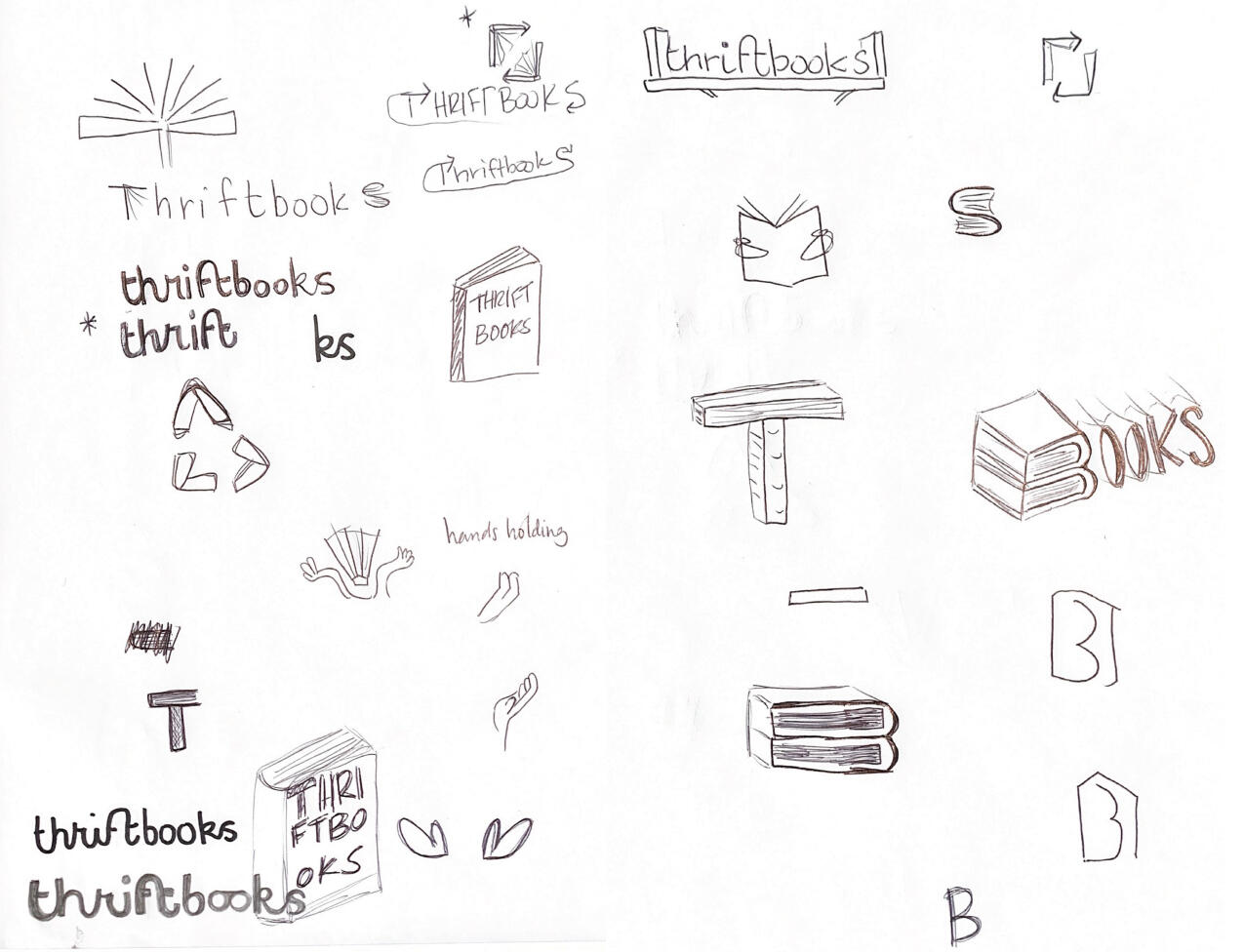
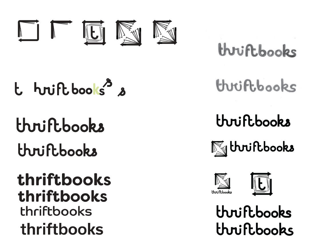
logo development
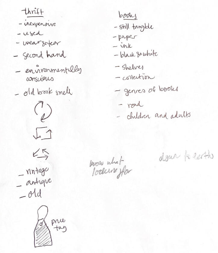
Word auditing
back to top
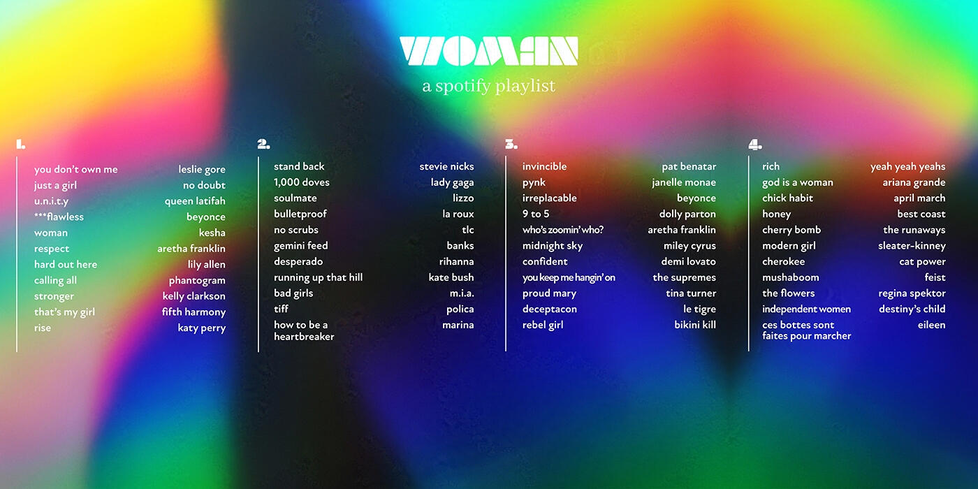
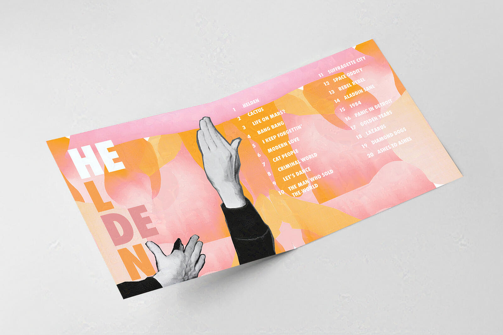
Spotify Playlist Vinyls
Woman: a Feminist Playlist
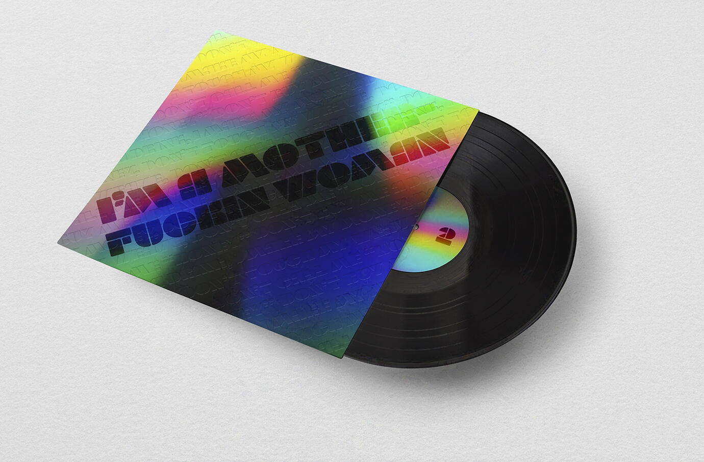
All songs by female artists.Cover based off the song “Woman” by Kesha, whose chorus lyrics chant: “Don’t buy me a drink, I make my money, don’t touch my weave, don’t call me ‘honey’.”I was inspired by this repeated chant to design a typographical texture based off of it, which is debossed.
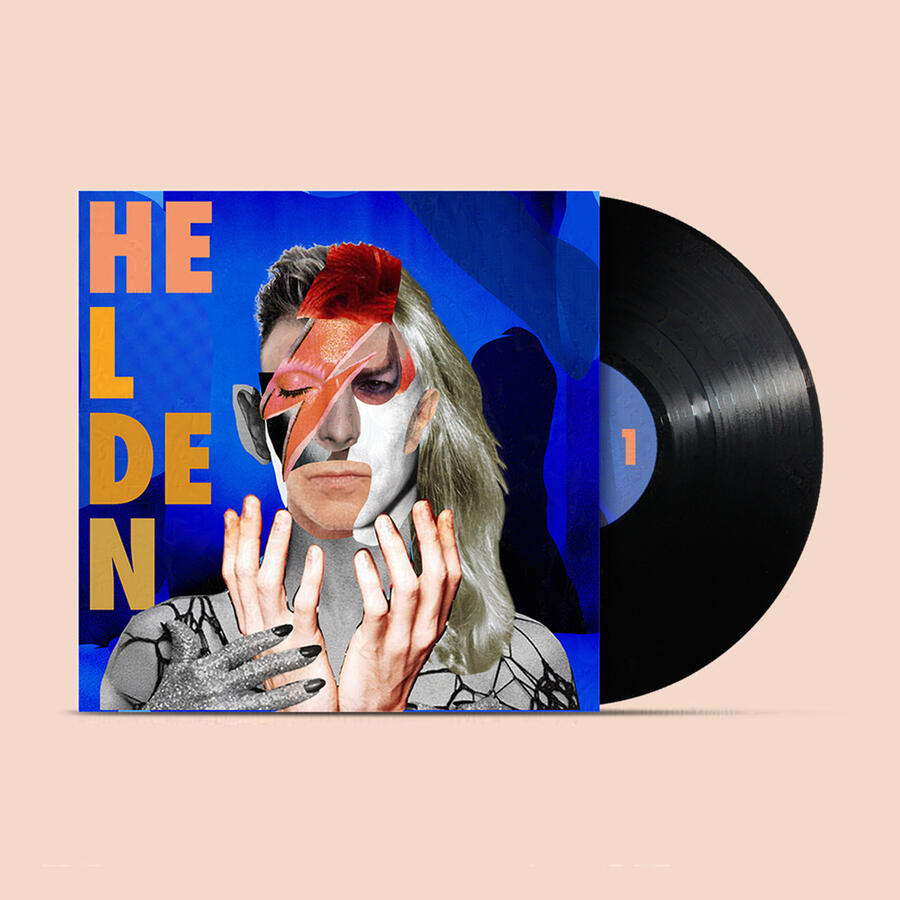
Helden: a David Bowie Playlist
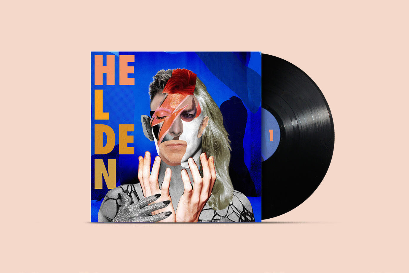
A collage of multiple images of David Bowie representing all of the years of art and talent in his repertoire.The title, “Helden,” is from his German version of the song “Heroes” which I felt was fitting because of how influential David Bowie was and is to artists today.
back to top
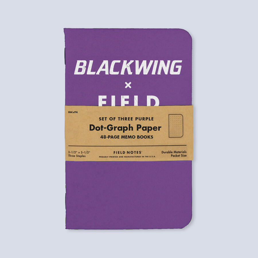
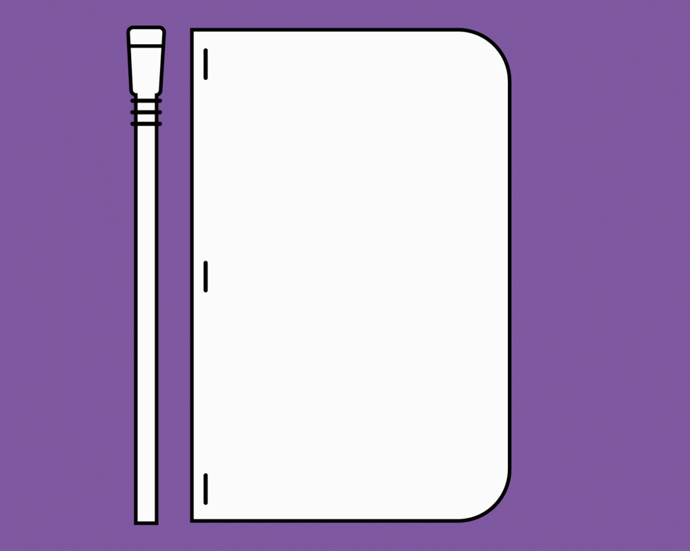
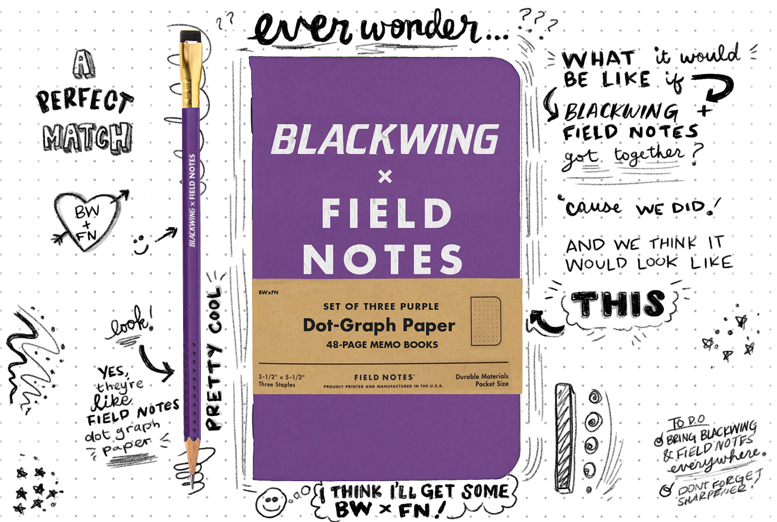
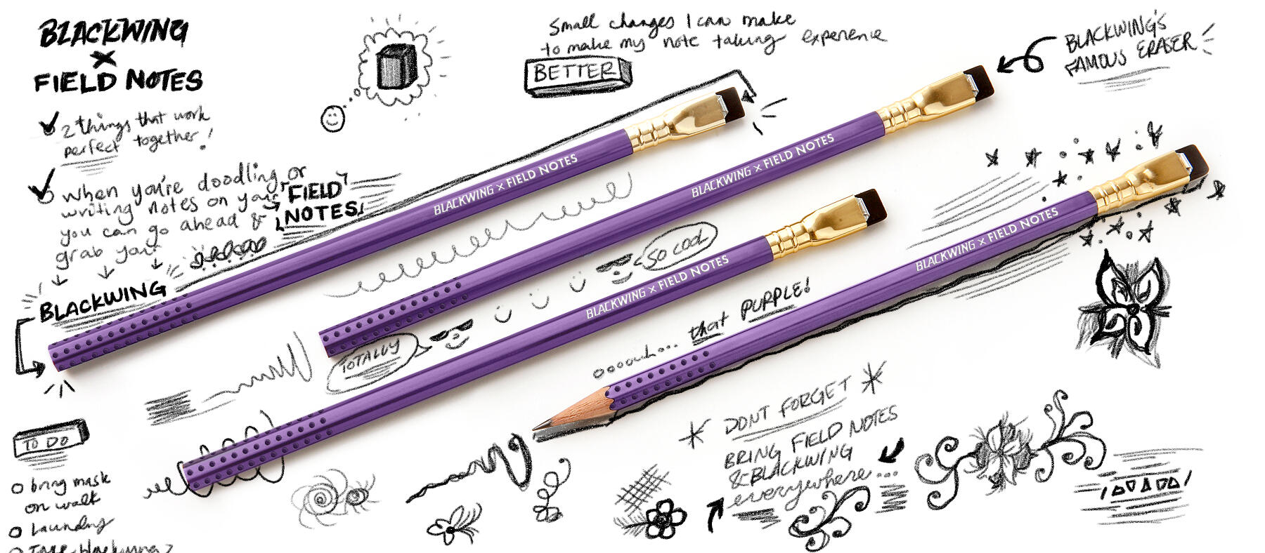
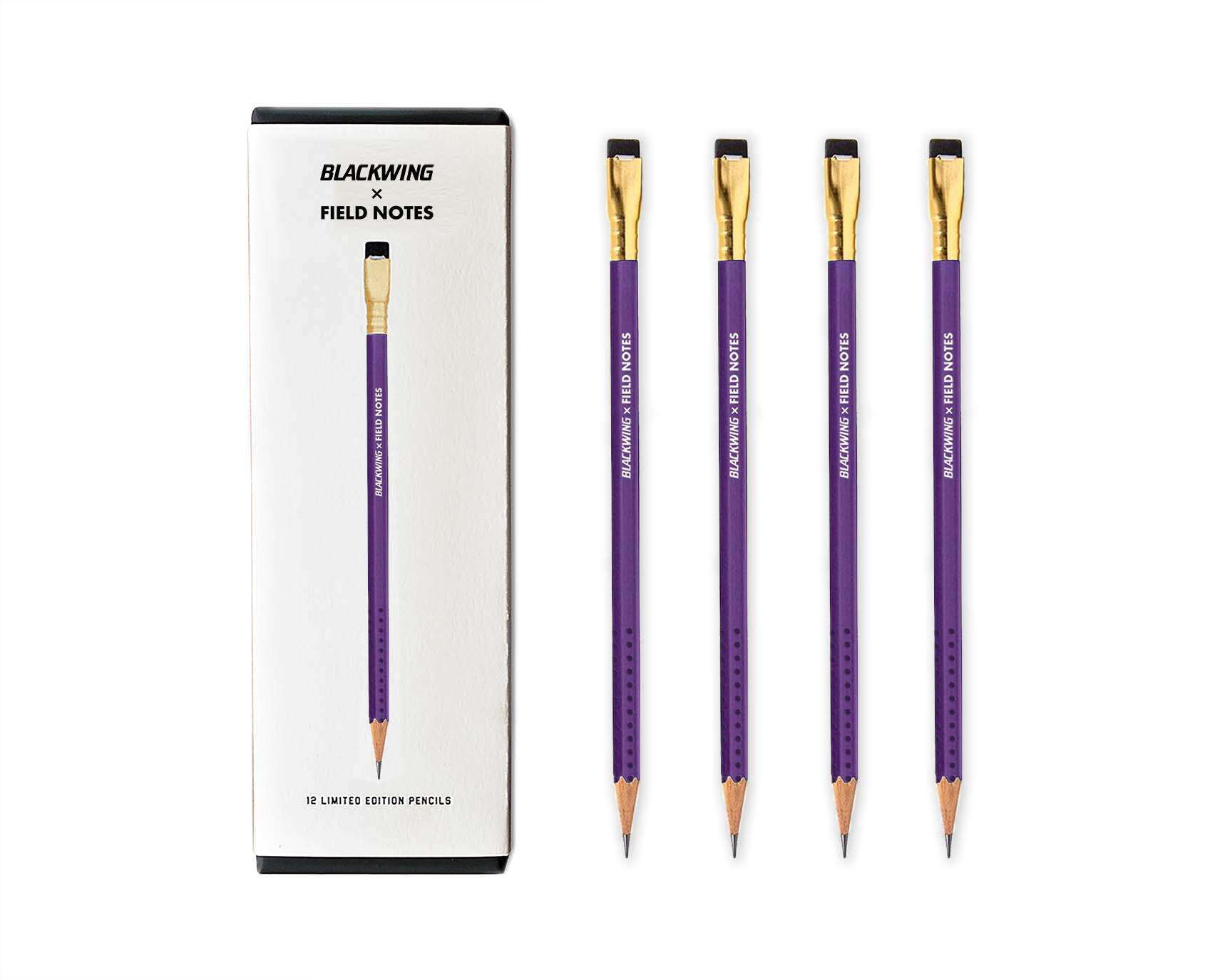
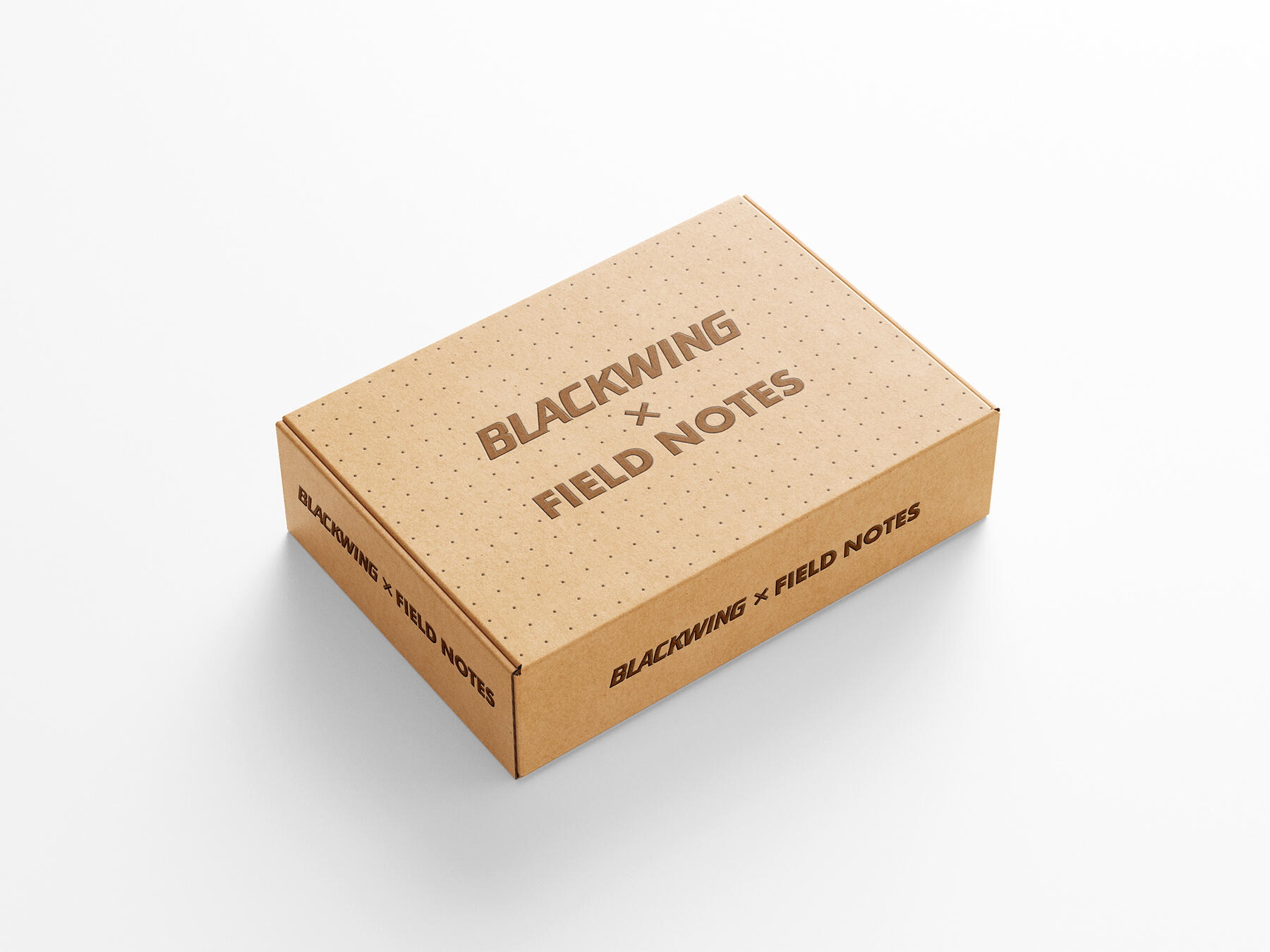
Blackwing x Field Notes
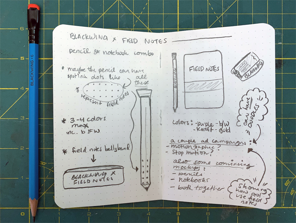
Concept
Blackwing and Field Notes are my absolute favorite and, if I can be biased for a second, the best utensils to take notes, draw, doodle, have in the car, all over the house, etc. I adore both of these brands. So it’s a no-brainer that they really go perfectly together.Hence… Blackwing x Field Notes. A campaign I put together to show just how symbiotic these two brands are.
Teaser Motion Ad
Print Ad
I wanted the ads to emulate how a person’s notebook would hypothetically look, so I made my own notebook style background using my own lettering and little doodles. I used a pencil brush in Photoshop to achieve the sketchy look. The Blackwing pencils would have a spot ink/embossed dot graph pattern similar to the famous dot graph paper in Field Notes.
Stop Motion Ad
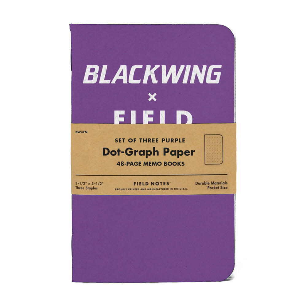
Field Notes x Blackwing Product & Packaging
Mailer
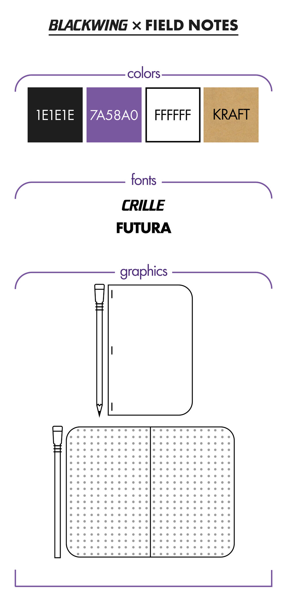
Style Guide
back to top
Collex

Collex V2

Research

Collex V1
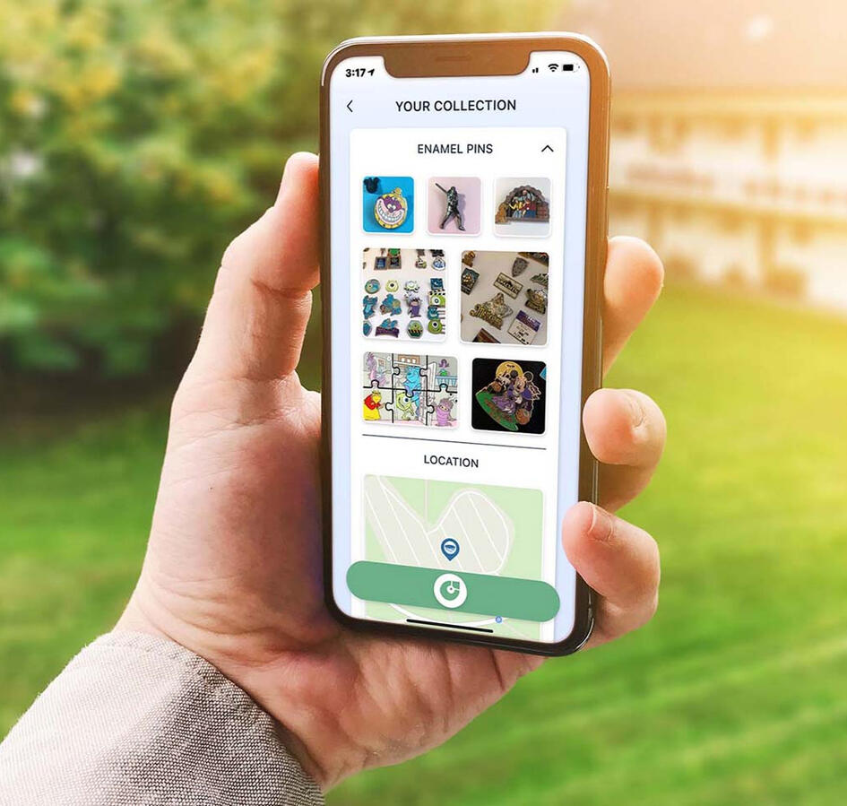
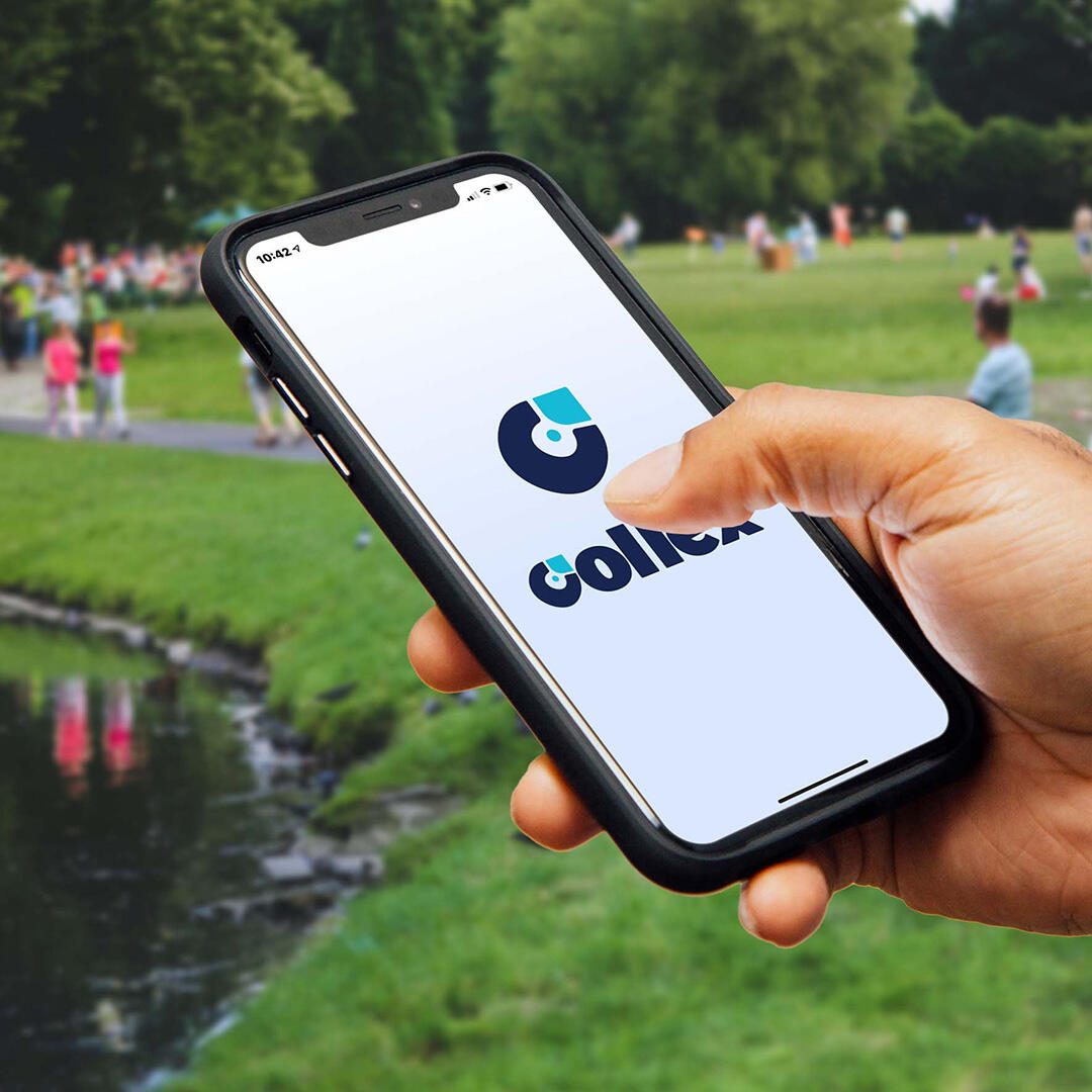
An App for Collectors
Collex is an app that is meant to inspire those of us who collect to really have fun nurturing this very human aspect of our lives on a regular basis.
If you would be interested in seeing the first version of Collex, please check it out here
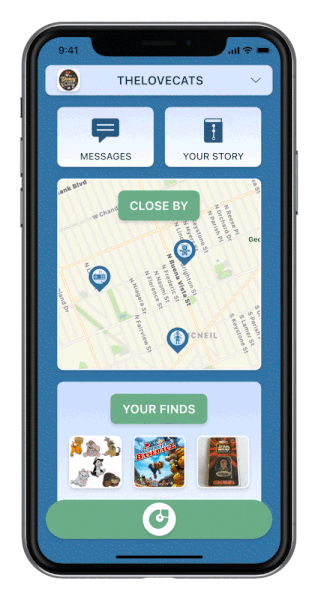
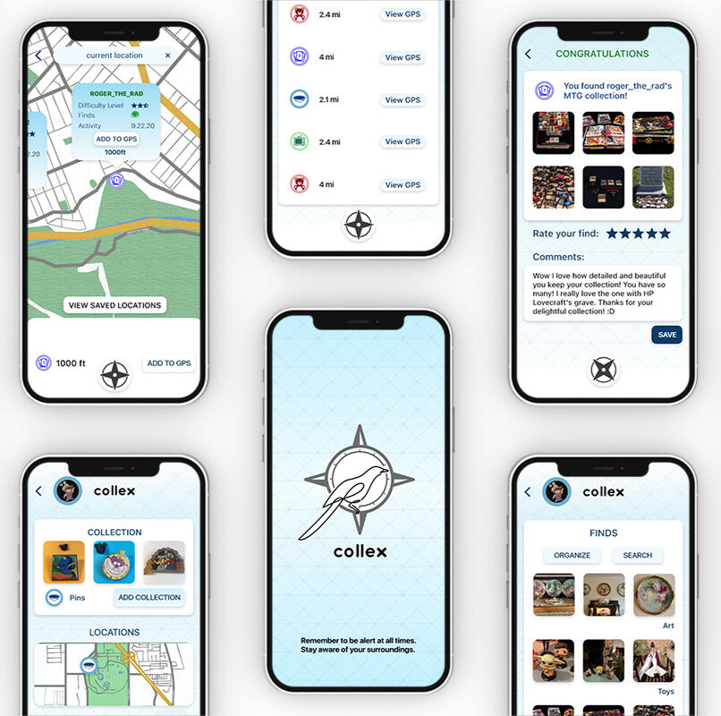
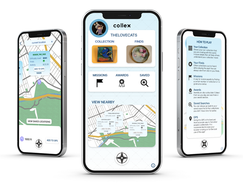
Everything on the Home Page
Collex is an app for people who enjoy collecting to interact with each other and find each other’s collections they’ve cached somewhere on the map!
Add to Your Collection
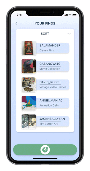
If you want to see what you’ve collected on the app, all of your finds will be in one convenient place.
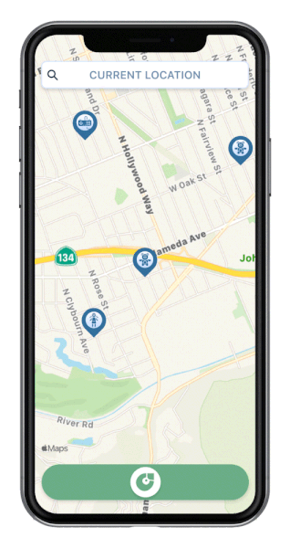
Discover new Collections
Whether it’s taking a walk in your neighborhood, or when you’re out of town, Collex will always be there for you to search for people’s placed collections!
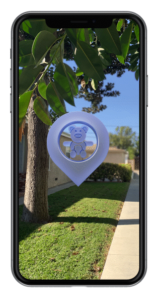
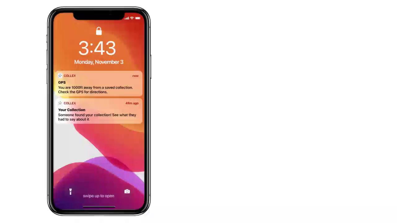
Augmented Reality
After following the GPS, your screen will help immerse you into the treasure cache of the collection your just found.
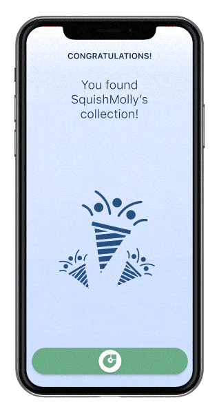
An Insight Into Another Collector’s World
When you find the cached collection, you will be able to see everything conveniently on your screen, and have a chance to learn about the person and their collection.

An Insight Into Another Collector’s World
When you find the cached collection, you will be able to see everything conveniently on your screen, and have a chance to learn about the person and their collection.
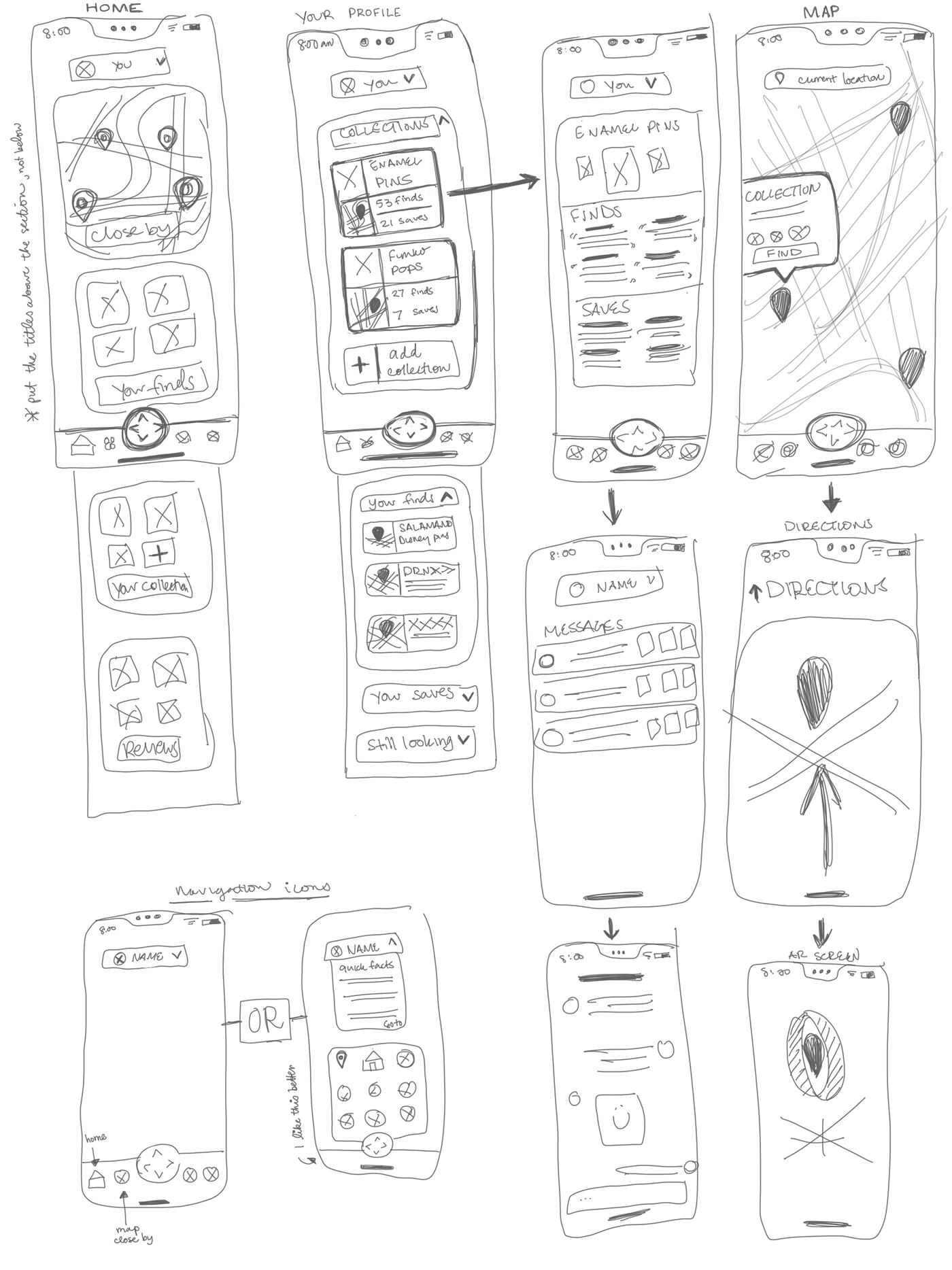
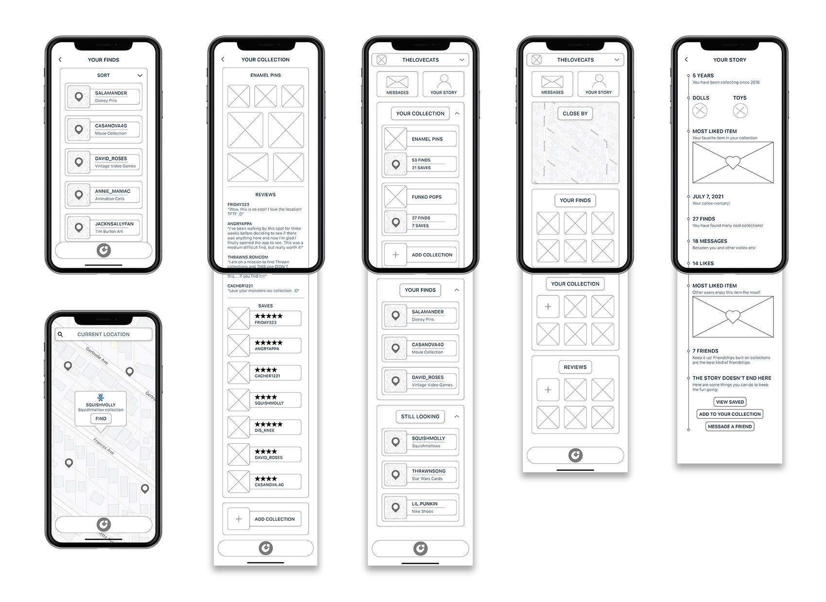
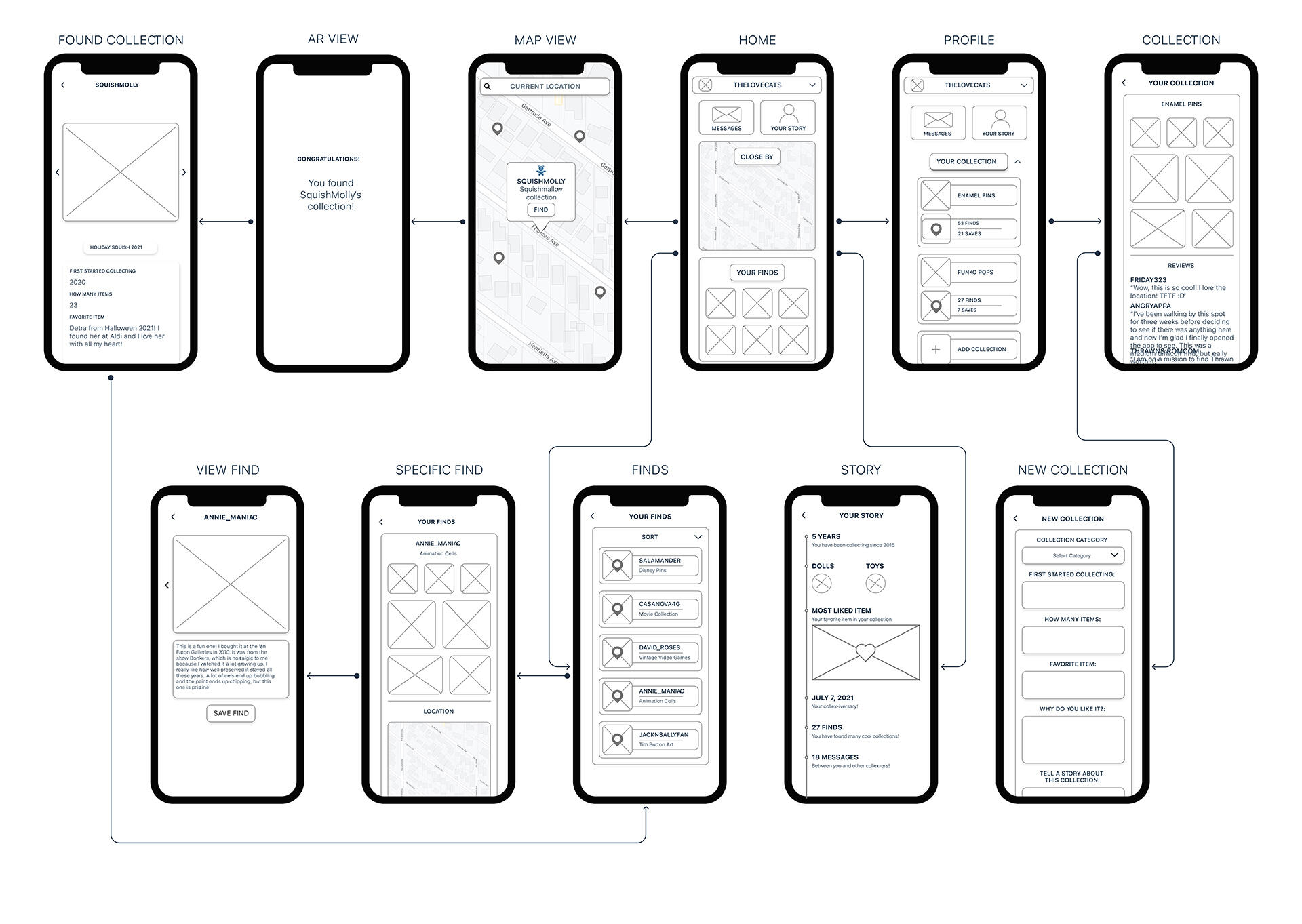
Wireframe Sketches
Digital Wireframes
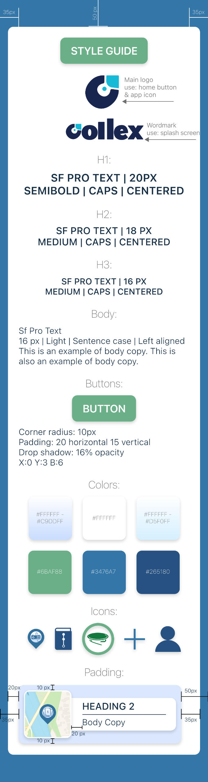
Style Guide
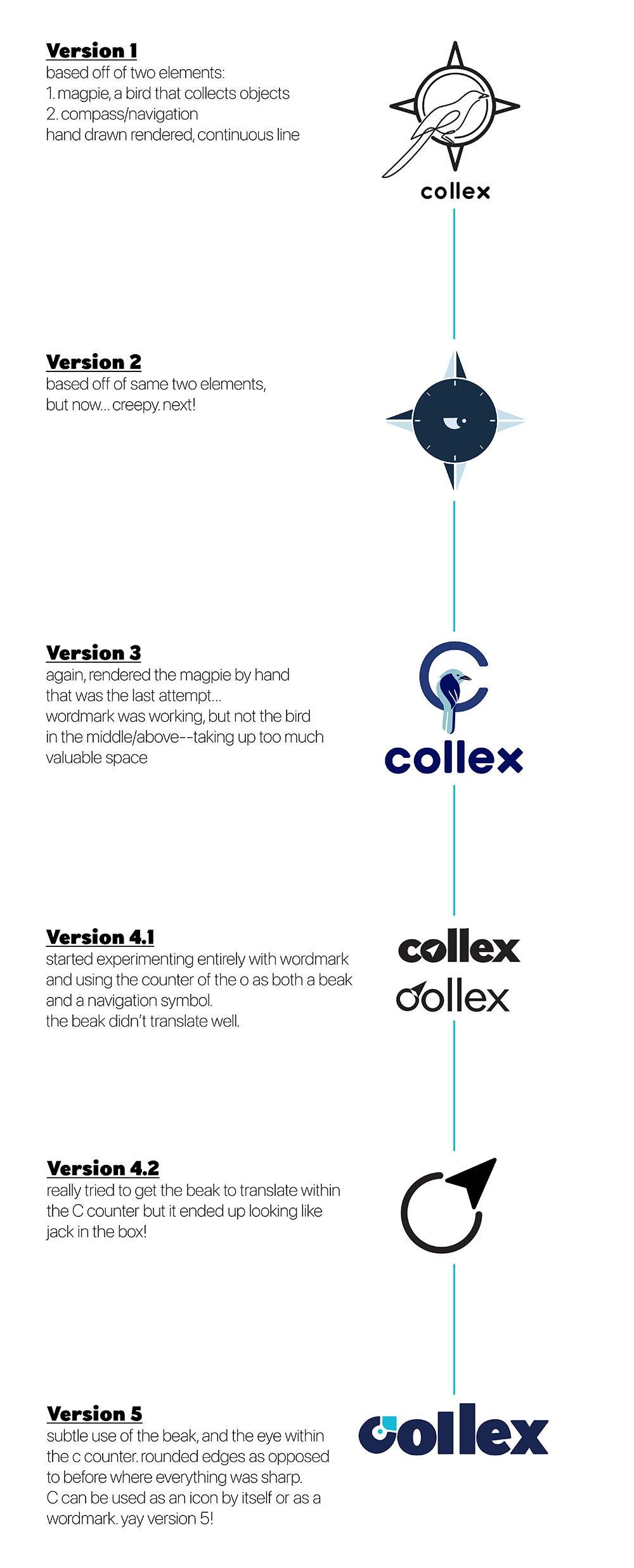
Logo Development
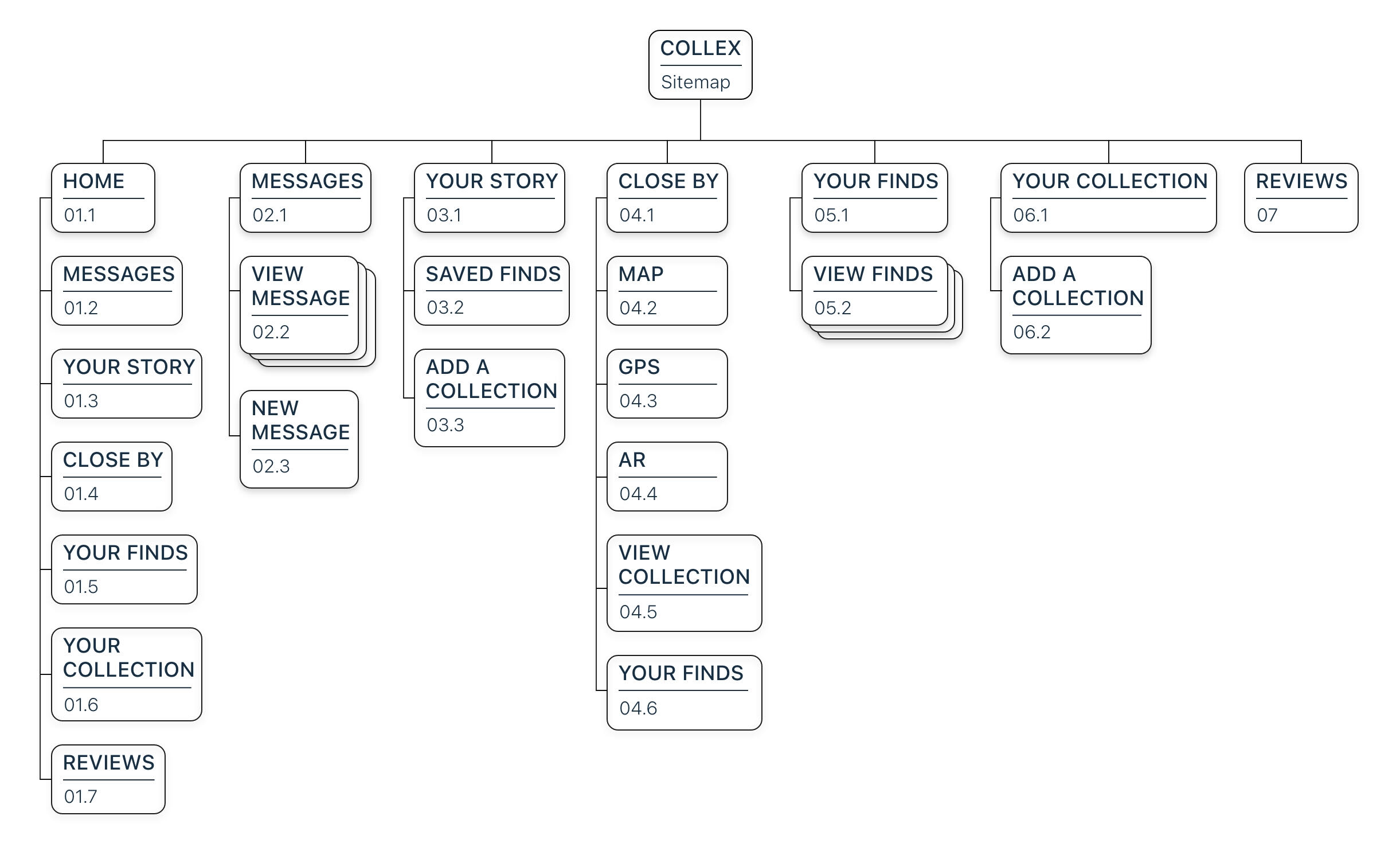
Site Map
Userflow
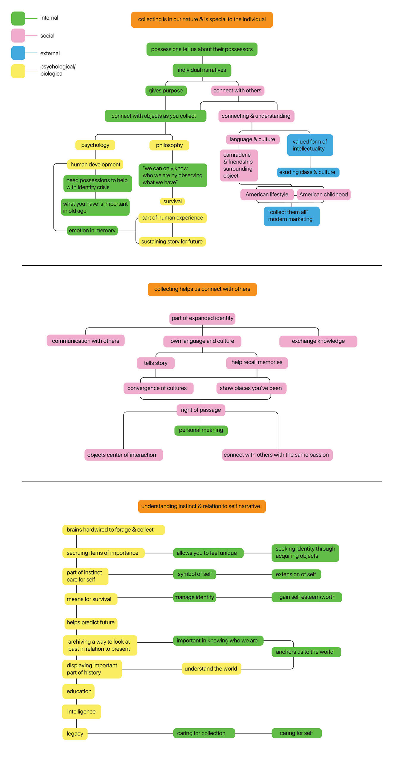
Research Survey
Categorizing Key Words
back to top
Collex Version 1
Collex is an app I designed to provide a digital space for communicating the importance of collecting in ways that may not have been considered before.
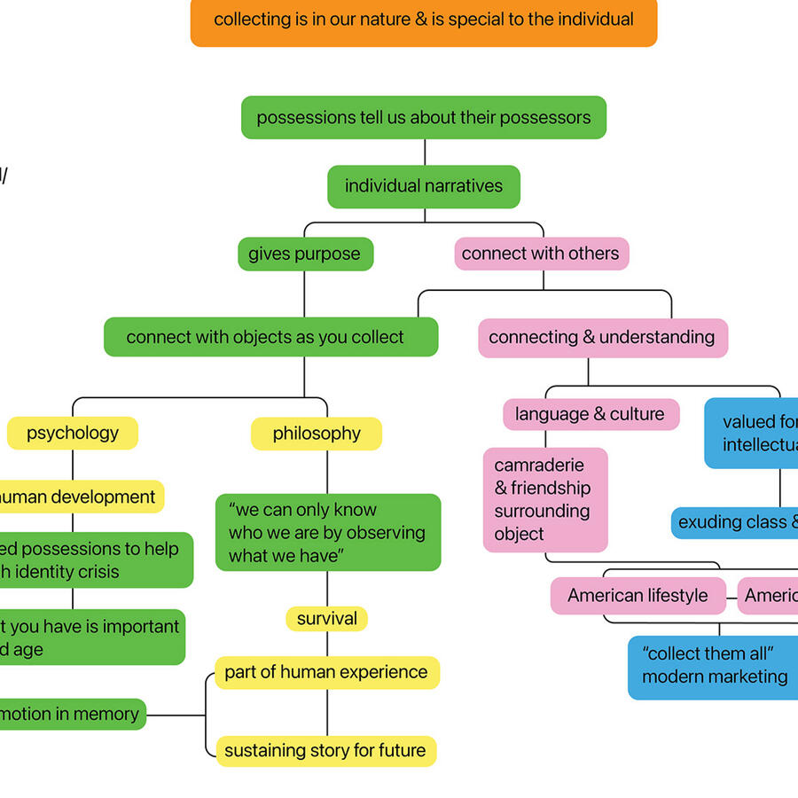
I conducted many types of research for six months about the habits of people who enjoy collecting. Among my research, I found the psychological aspects to be the most interesting.Almost every person who collects does it for personal reasons.
Some of the reasons a person can collect are:
Additionally, people who collect tend to be part of certain communities which have their own culture. The culture can include phrases and names given for pieces of the collections, gatherings and conventions to meet, ways to organize their collections, and so on.However, I noticed that about half of the people I surveyed in my research did not associate themselves with any collecting community. I thought that was interesting, and was curious if there was a way to bring people together in a non-invasive sort of way.This is when I decided that the most appropriate design solution would be to make an app that allows people to connect with each other on their individual collecting narratives. This would give people the ability to communicate with each other on what makes their collections so special, while also abiding to COVID-19 restrictions, and using the app as a game would make it fun for each individual.Collex allows the user to place items of their collection digitally in a public location of their choice on the map. Then, other users find the collection with GPS. Once they are near the collection, the augmented reality screen would appear and show the collection they found, as well as the added story the user provides.

Collex Promo VideoPromotional Video visually explaining how collex works in real time.
Collex PrototypeCollex prototype with added flowchart giving a general feel of how the app would work.
back to top
ATI Restoration
In-house design work for ATI Restoration,
the nation’s largest family-owned property restoration contractor.
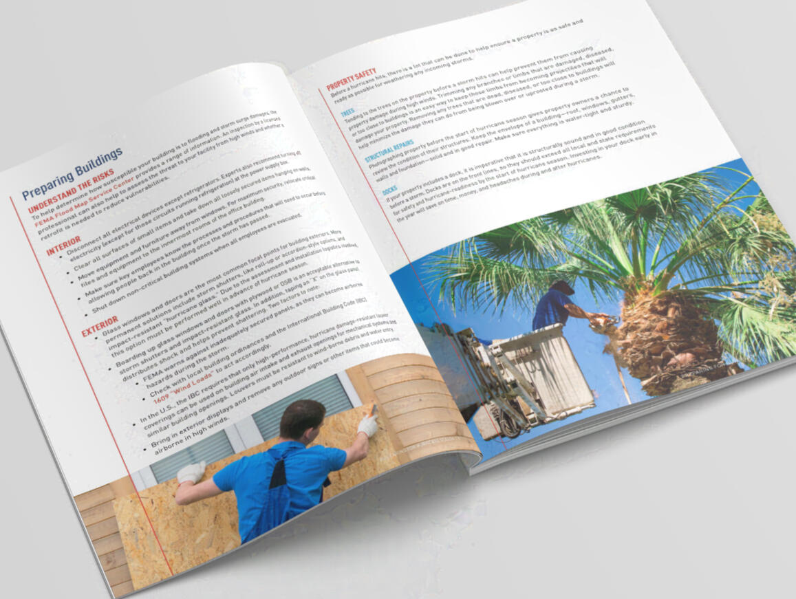
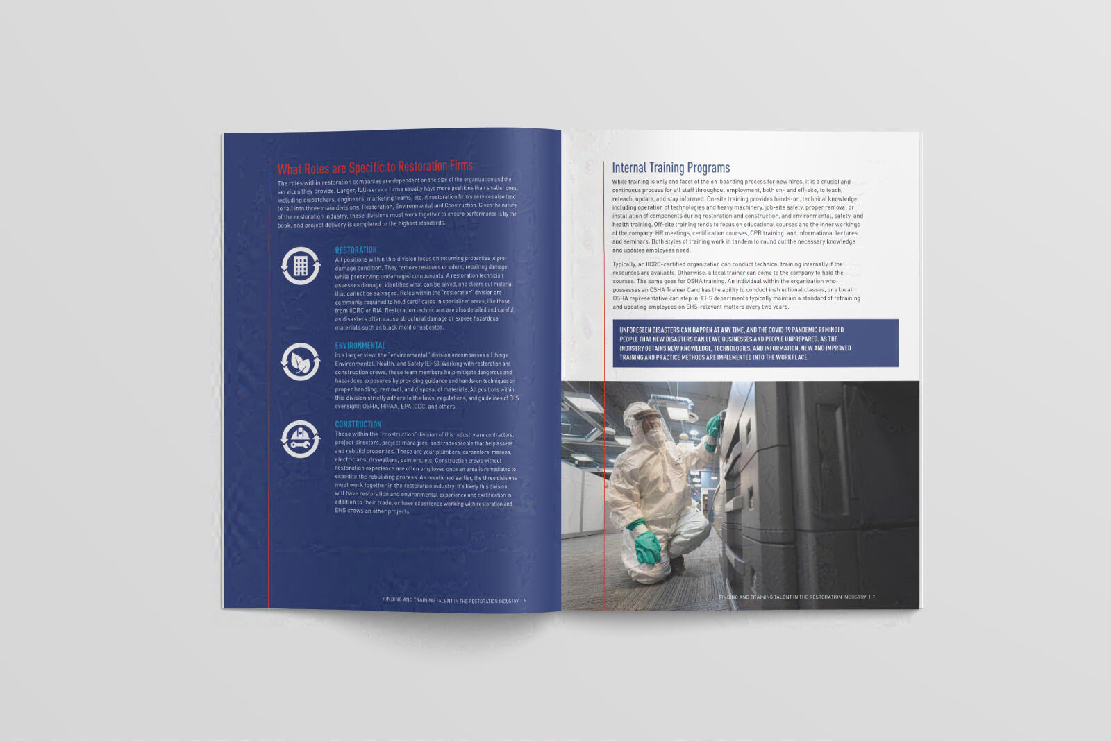
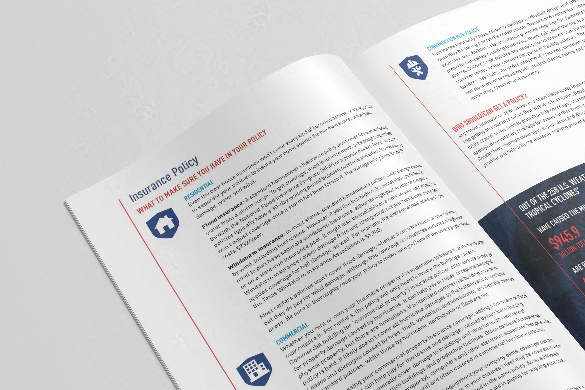
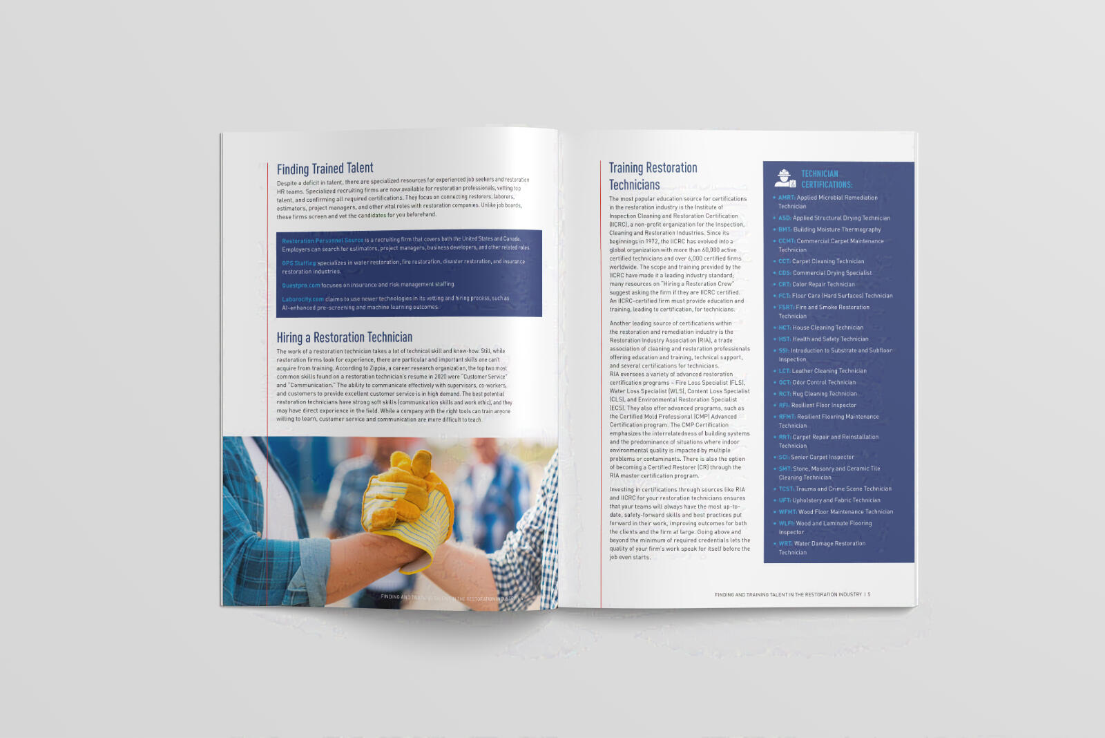
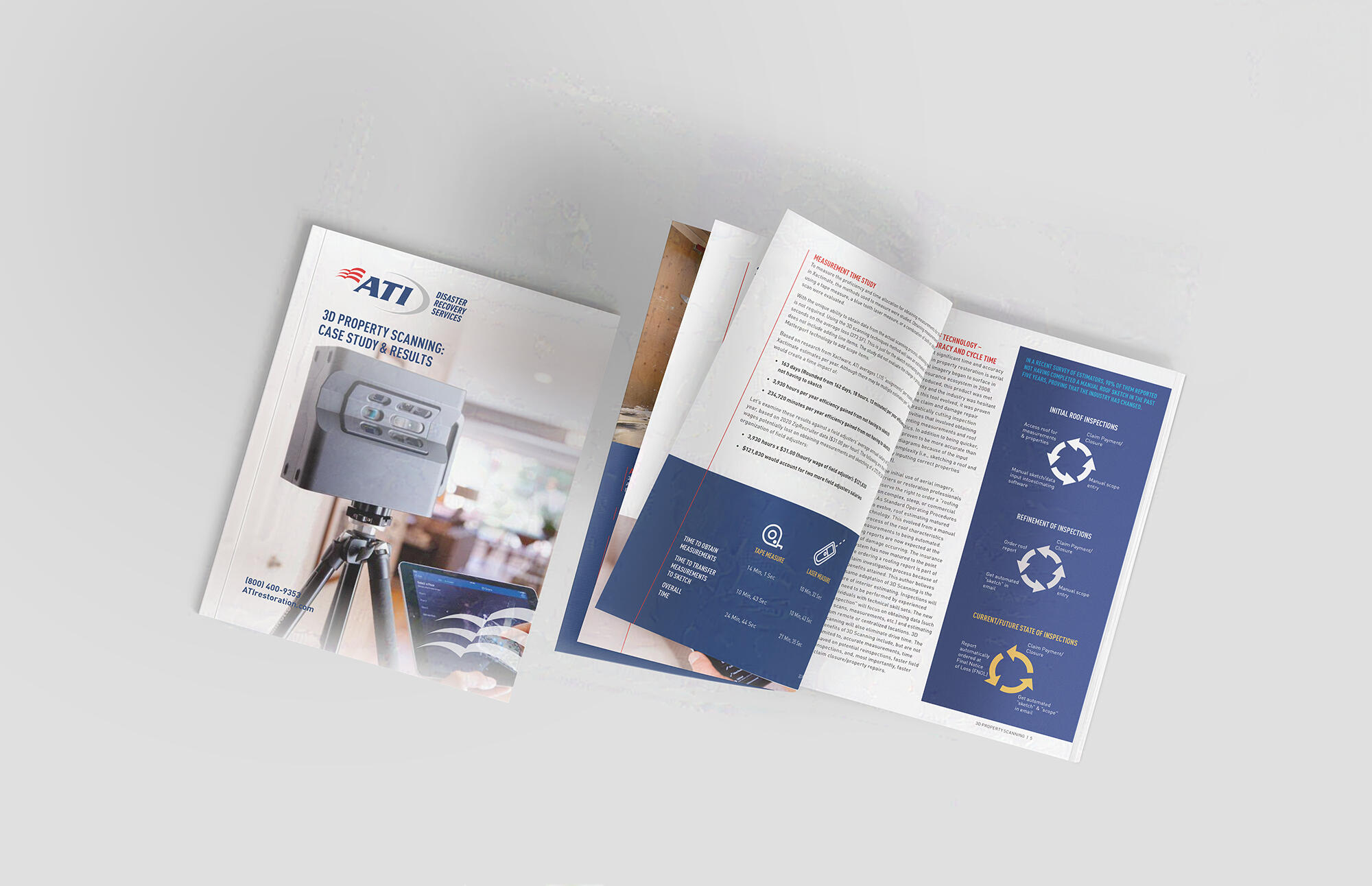
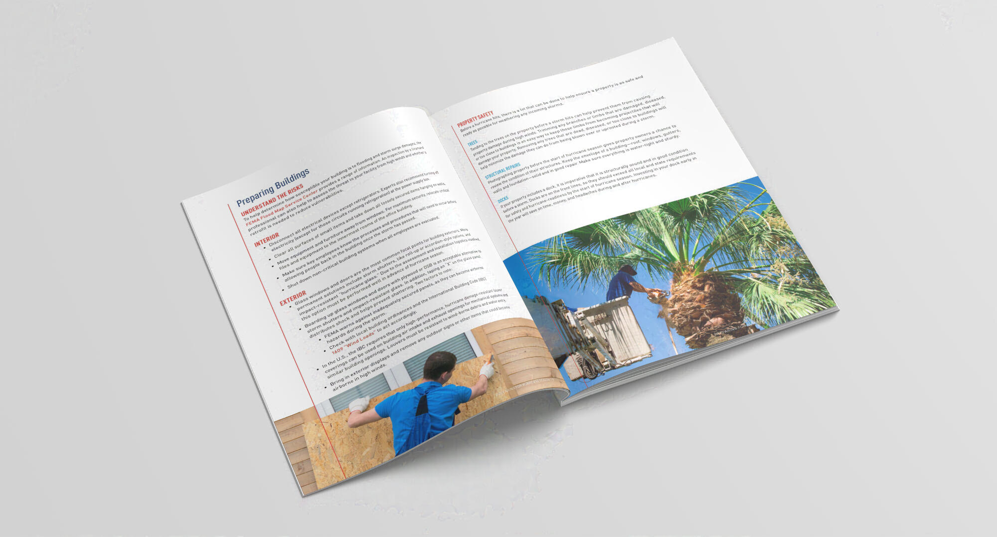
Whitepapers
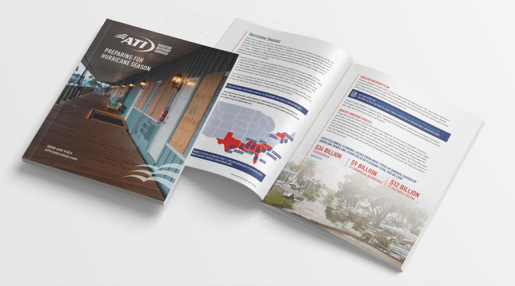
Various designs for whitepaper PDFs available to the public. Each whitepaper is written on a topic/theme covered in monthly newsletters.
Responsibilities include utilizing image library to find appropriate imagery for each whitepaper topic, typesetting with the ATI branding, layout design, editing copy, and designing icons and infographics.
Newsletters
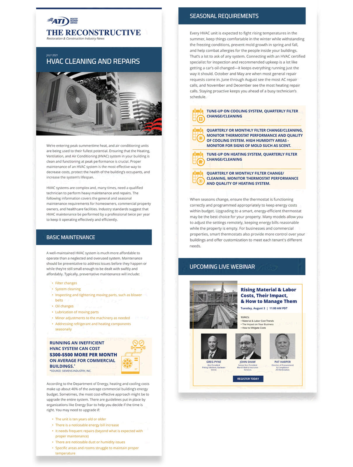
Responsibilities include:
Working on Pardot (Salesforce) and using HTML to design email campaigns
Design wireframes with Adobe XD
Design supplemental downloadables (guides, whitepapers, flyers), imagery and callout sections
Email Campaigns
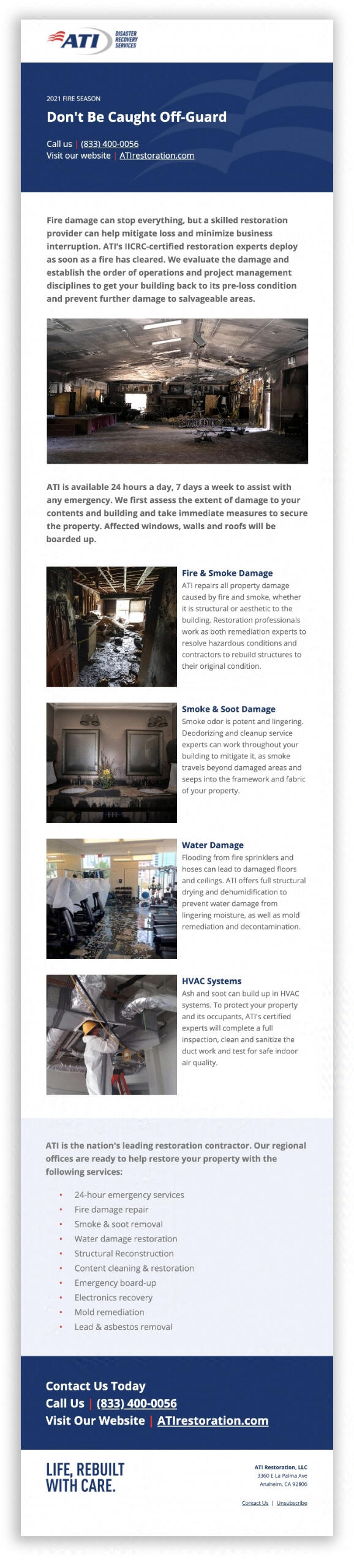
Responsibilities include:
Working on Pardot (Salesforce) and using HTML to design email campaigns
Design wireframes with Adobe XD
Design supplemental downloadables (guides, whitepapers, flyers), imagery and callout sections
Setting up engagement studio for sending and tracking campaigns
Making sure emails are responsive on multiple screens
Website Events Page


Responsibilities include:
Add a new feature on the website to show events coming up, whether they be trade shows, webinars/seminars, or continuing education
Easy access to dates and times with ability to search and check off applicable categories
Keep consistent with existing website branding, look and feel
Gable Box
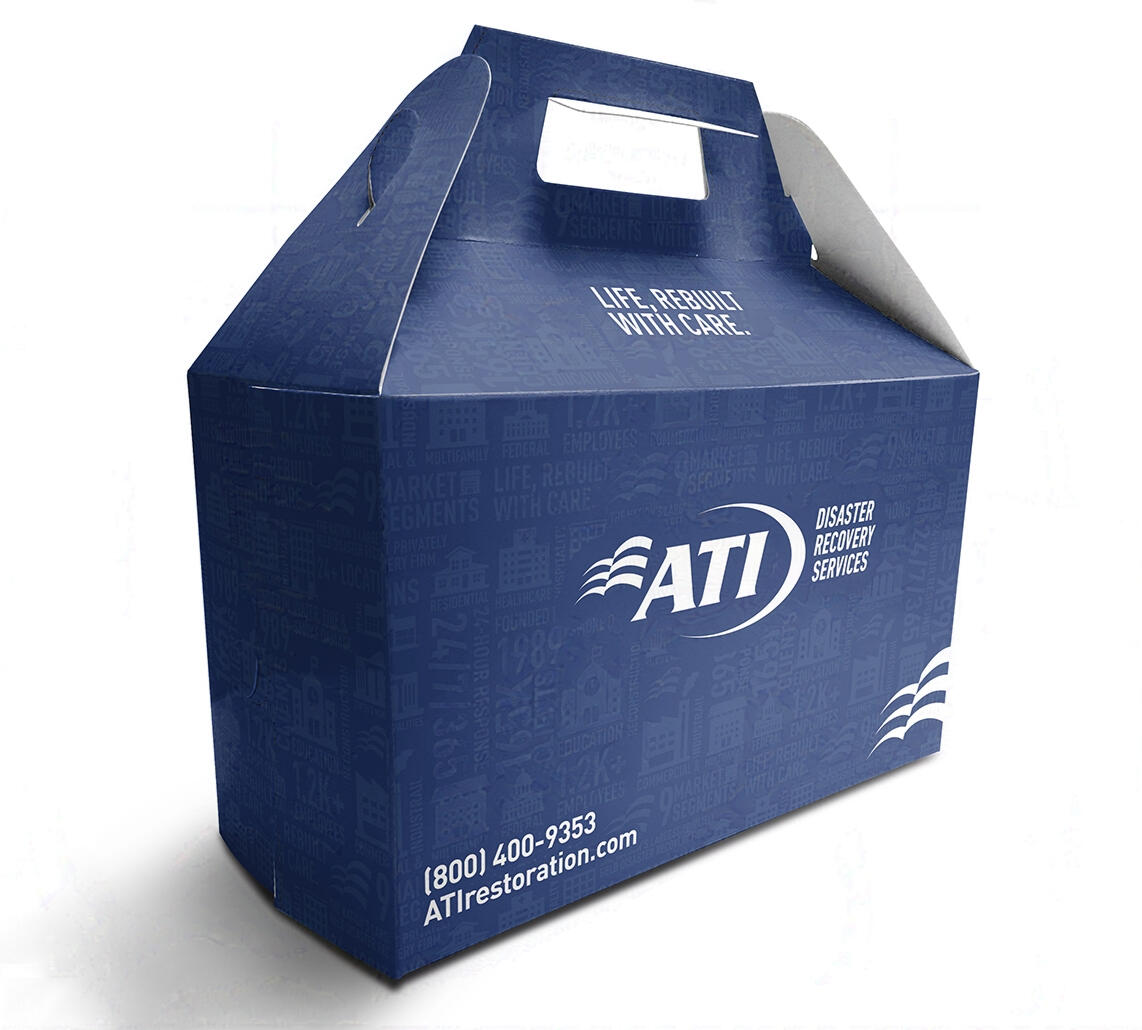
Brief:
Promotional package for use with business development team
Team members visit various clients and prospects often and would like a package to hold baked goods for clients
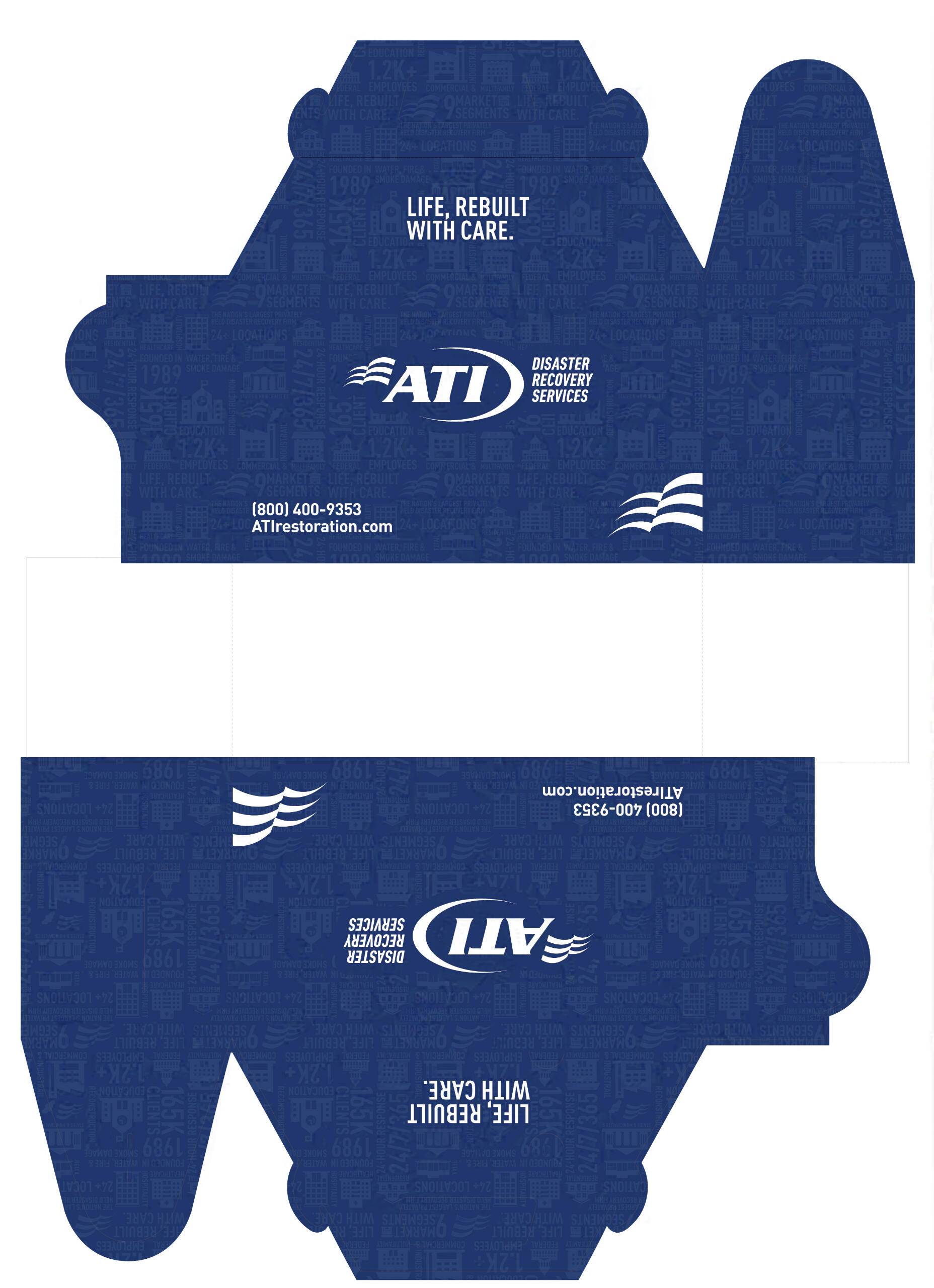
Dieline:
I designed the gable box to have an infographic pattern. It is composed of icons and words commonly used within the branding.The pattern is low opacity/screened back due to the intensity of these icons in their original form. Knowing there was only going to be a limit of two colors, the best option was to screen them back and use them as more of a texture.
Collateral


Brief:
Add list of services
Make the flyer dynamic with use of texture on the header
Show a before and after from our library of job photos
back to top
La County | Regional Planning
Various volunteer and internship work for Los Angeles County Department of Regional Planning
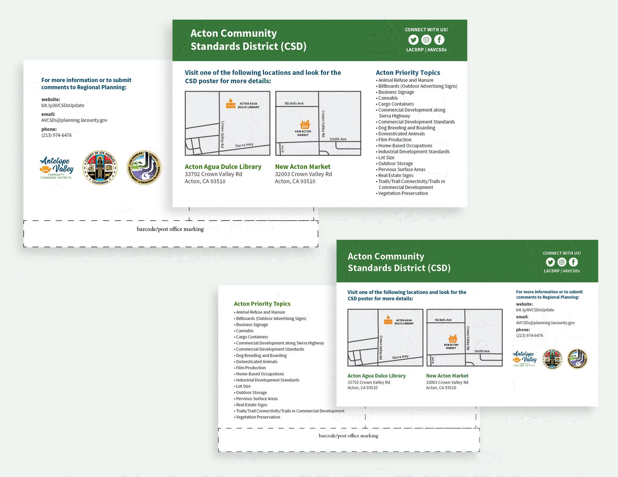
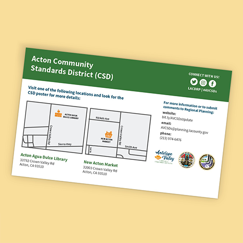
Antelope Valley Community Standards
Two postcard options I designed for which were sent out to residents of Antelope Valley in the summer of 2019
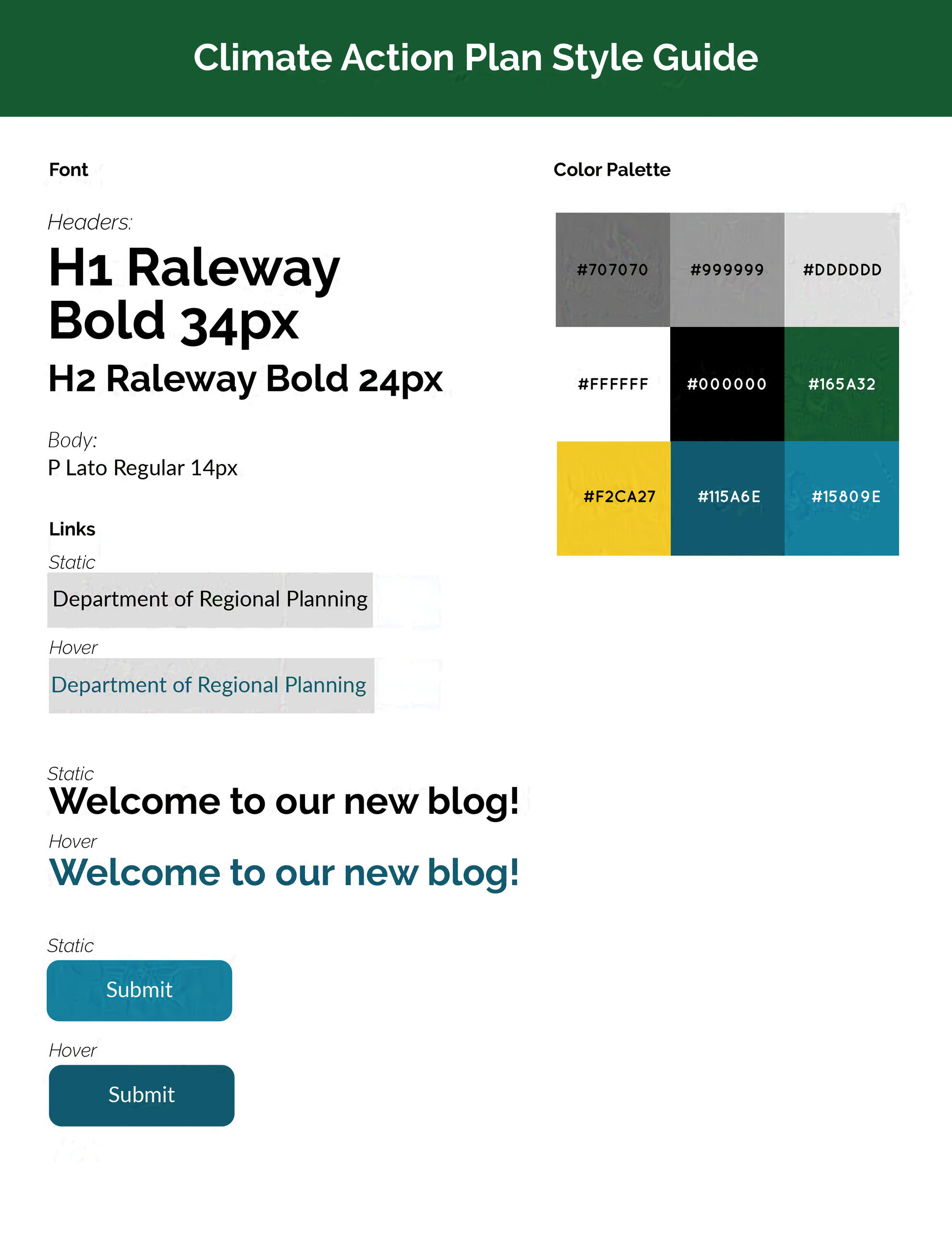
Climate Action Plan
A style guide I designed for the systems team to use on a new WordPress blog for the LA County. All colors used are accessible for ADA color contrast requirements.
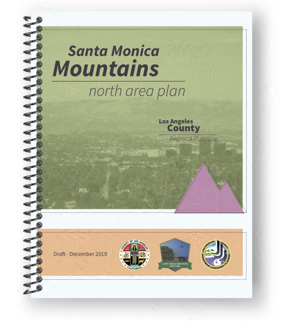
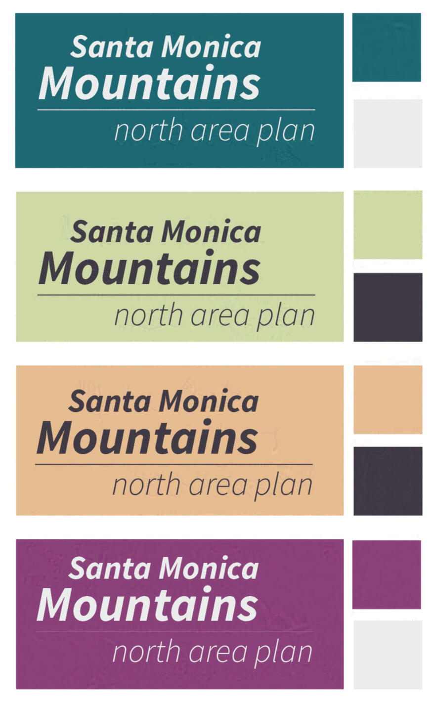
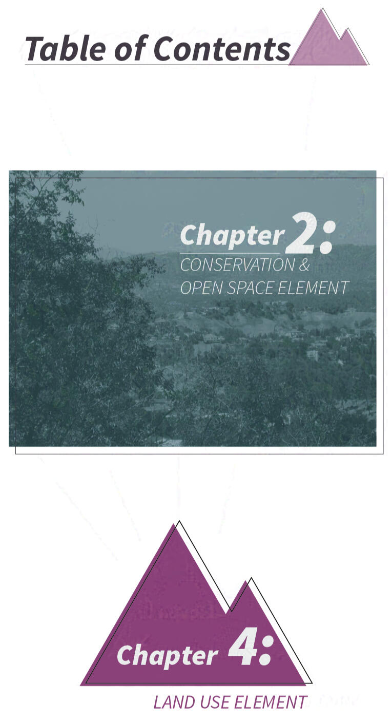
Santa Monica Mountains Nort Area Plan
A redesign project for a multi-page document focusing on correcting previous colors and styles for web accessibility. All typography must be license-free. Using assets provided, such as photos and official logos of the Los Angeles County.
Colors & Styles
I based the color palette off of native flora and fauna of the Santa Monica Mountains.
Transformative Climate Communities Housing Report
Cover I designed for a multi-agency document on Transformative Climate Communities Housing Report. Photos and footer logos were provided and required to be in layout.
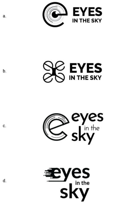
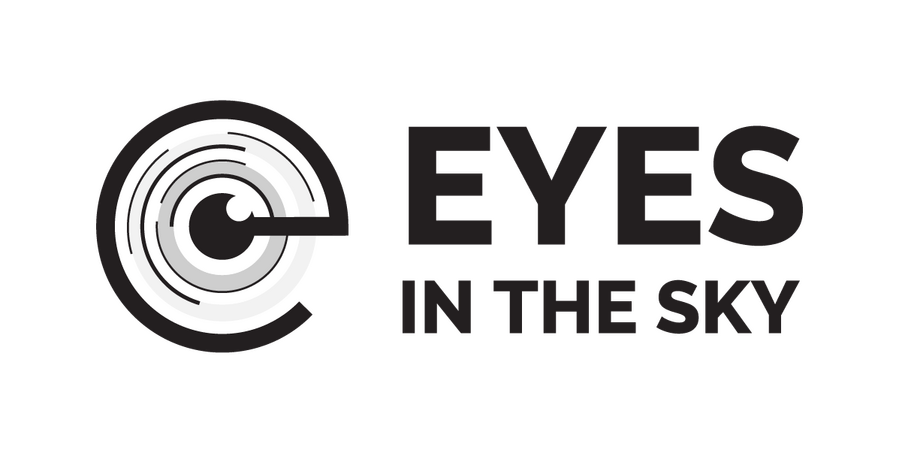
Eyes in the Sky Logo Development
Four logo options I designed for the Zoning Enforcement meeting to propose use of a drone. The team chose option b. to use for their presentation to the head of Regional Planning.The concept for each logo was to use the e as a drone blade.
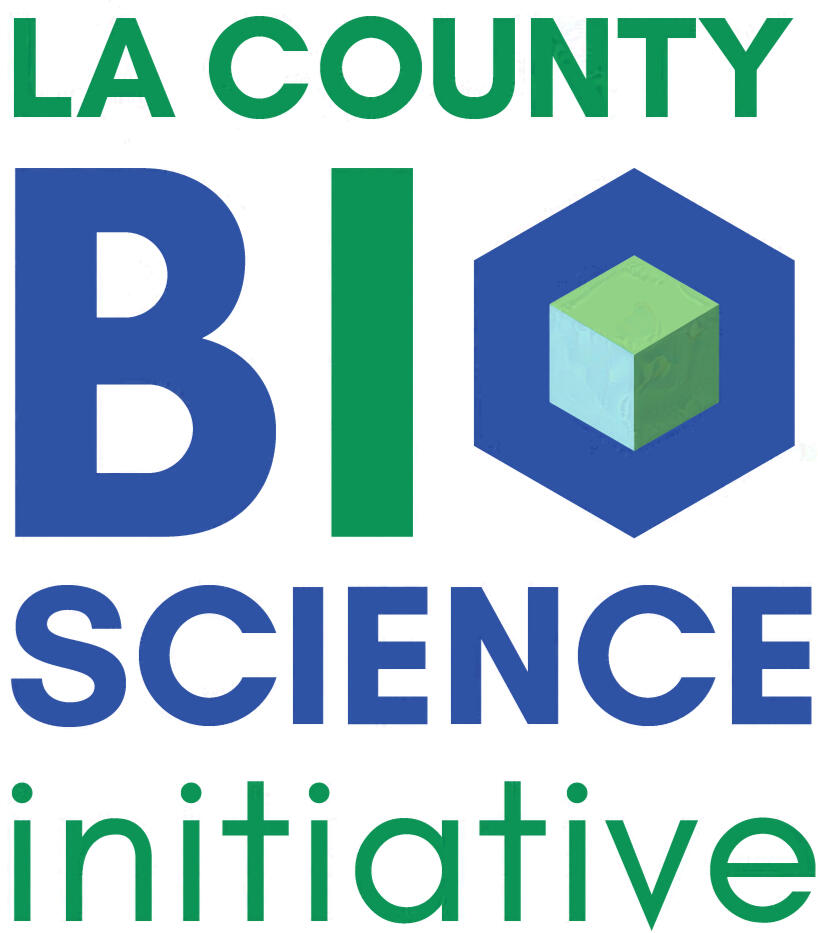
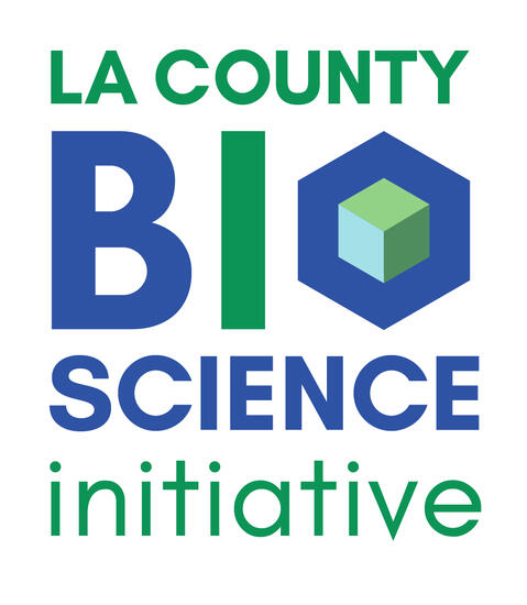
LA County Bioscience Initiative
A logo I designed for the new division of LA County Department of Regional Planning


Concept & Logo Development
Hexagonal structure: a naturally forming design that us uniquely economical. The shape is found in bee hives, bubble rafts, crystalline structures, water, and the eyes of insects, as well as certain chemical compounds.
back to top
various logos

back to top